
This week we are going to plot some offender footprints - the multiple places where one offender commits crimes and lives. I am also going to show you how to make multiple maps in one map document. The first walkthrough shows how to make an inset map, the second shows you how to make a set of small multiple maps. I interject several other tutorials on the way though, such as digitizing your own spatial data and setting map projections.
You can download the data for this weeks project from blackboard or from https://www.dropbox.com/s/3h59pm81iqqhiv5/10_OffMobility.zip?dl=0.
In this section we are going to plot a series of graffiti incidents by the artist Banksy in New York City. The data are taken from this article in the telegraph. Kim Rossmo and company had geoprofiled Banksy graffiti locations in the UK. After I posted this data online Kim Rossmo actual did a geoprofile of the NYC data, so we will incorporate his predictions into our map.
First, create a new map document, and then import an online basemap via File -> Add Data -> Add Basemap. Choose the Dark Gray Canvas Option.
Now import the CSV file that contains the latitude and longitude coordinates of the graffiti locations, Bansky_Data.csv, as well as the shapefile of the NYC county outlines, NYC_Counties. Right click on the table, and select Display XY data. The correct lat and lon fields are auto-populated into the form, but we need to specify the projection used for the dataset - or lackthereof in this instance. Click the edit button in the Display XY Data Form.

This brings up what should be a familiar dialogue. Here you want to go out of the Projected Coordinate Systems folder and go into the Geographic Coordinate Systems folder. Then you want to go into the world folder, and then choose WGS 1984. Most web maps take WGS 1984 as the input system for latitude and longitude coordinates.
The next three images show this process.


Hit OK in the Spatial Reference screen once you have chosen WGS 1984, and then hit OK in the display XY data dialog. Now zoom into New York City (pro-tip, right click on a layer in the table of contents and select Zoom to Layer) so you can see the graffiti locations. Here I styled the points bright red with an outline so they easily stand out against the dark map background.

Now we are going to label the points in the order the taggings were committed. I find this a simple way to show the order of crimes on the map. So now right click on the point data layer and select Properties. Then navigate to the Labels tab. In the labels tab, select to label features in this layer, select Order as the label field, in the text area select the labels to be bold, and then hit the placement properties button.

This dialog has several options for labels. By default labels are offset from the points, but here we can place the number directly on top of the point marker. So in the placement tab select the option below.

Then navigate to the conflict detection tab. Here specify that labels can overlap one another.

Once you hit OK and then apply the changes back in the Properties dialog, your map should look like below.

In this next step we are going to make a second map. One to show the overall pattern in the graffiti locations, and one to show a zoomed in location where Kim predicted that Banksy lives.
To insert a second map into the document, go to Insert -> Data Frame.

You will then see that you have a new location in the table of contents showing the stacked layers icon and simply named New Data Frame. Double click on the original Layers and New Data Frame to rename them to Overview and Inset. Next a quick way to make it so each map has each dataset hold down the Ctrl key and select each of the layers. Once each is selected, right click and select Copy.

Then you can right click on the Inset frame, and paste those layers. You will then see that both of the frames have the Banksy data, the county outline, and the basemap imagery.

Next we are going to zoom into where Kim predicted that Banksy lived while in NYC - somewhere in Greenwich village. Go to the file menu and select Bookmarks -> Manage Bookmarks.

Then you will see the Bookmark manager dialog. Select the Load button, and navigate to the Greenwhich.dat file that I disseminated. Once this is loaded, select it and then hit the Zoom To button. This should zoom into the area shown below. Note to make a new bookmark is easy - just select Create Bookmark instead of Manage Bookmarks, and it will create a bookmark of the current map view.

In the next section we are going to make a simple outline. As a direct quote from Kim Rossmo, he stated that the location with the highest probability where Banksy lived based on his geoprofile is:
Boundaries of peak area: north-south – West 14th Street to West 11th Street; east-west – 6th Avenue (Avenue of the Americas) to 5th Avenue
We can use this to quickly digitize our own polygon to highlight this area on the map. On the right hand side of the map, hit the catalog tab that in the default map is collapsed. (If you don’t have the catalog tab, which could happen if it was closed at some point, in the file menu to go Windows -> Catalog). Navigate down to the tree to a folder in which we can create and edit our spatial data.

Then right click on your folder you want the shapefile to be created in and select New -> Shapefile.

Then in the Create New Shapefile dialog that pops up hit the Edit button below the Spatial Reference box. The spatial reference of the county shapefile should auto-populate the Favorites area, NAD_1983_UTM_Zone_18N, so select that and hit OK.

After that, make sure to replicate the following fields below. Name the new file Home_Predict, make sure that in the Feature Type that the polygon dropdown is selected, and then you can hit OK.

This will automatically add the new shapefile Home_Predict to the map, but it is empty, so does not show anything on the map. Next go to the file menu, and select Customize -> Toolbars -> Editor.

This will make the free floating Editor toolbar pop up in your map. In the Editor toolbar, select the Editor button and then select Start Editing.

This will bring up a dialog of the different layers in the map. Select the Home_Predict layer and hit OK. (You might get a few more warning dialogs, but just hit OK.)

Once you get through all those dialogs there should be a new pane opened on the right hand side of the map. Now in the editor toolbar select the Create Features button on the righthand most side.

This changes the pane on the right of the map to the Create Features pane. Now in the construction tools box in the lower part select the Polygon shape. Then when you mouse over the map you should see the point turn into cross-hairs. Go around the map to select the four intersections. At the last intersection, double click, and this will finish the polygon. After double clicking the polygon should look similar to below. Note to make a proper shape, you need to follow the points of the polygon around the exterior in either a clockwise or counter-clockwise fashion.

Now go back to the editor toolbar, and in the dropdown select Save Edits, and then select Stop Editing and close the editor toolbar.

Before going to the next section, style the polygon so it stands out against the background. I made mine hollow, but have a thick and bright red outline.
This next section we are going to style the map layout so we have two maps - one an overview and one a zoom in (the inset). The overview will subsequently have a box that shows where the zoomed in location is in reference to the zoomed out map.
So now navigate to the layout view (circled below), and you will see your two separate map data frames.

Next make sure that the black arrow icon is selected on the toolbar. Then drag the zoomed in map so it is not directly over top of the zoomed out map. Then deselect the map frames by clicking somewhere outside of either map frame but still inside of the background page - such as the red diamond area. Then right click in that same area and go to Page and Print Setup.

In this dialog uncheck the use printer paper settings, and then set a customized width to 10 inches wide and 6 inches tall. Then hit ok.

Now back in the layout part of the map use guidelines to set up boxes where you want your two maps to go. Below you can see that I have set the two maps to be equal size. I have also turned off the background imagery for now (sometimes it makes the map run a bit slower). Using an inset map I don’t always make the larger map the same size though, sometimes it can be substantially smaller.

Next, select the zoomed out map frame (click in the red diamond area) and then right click and select properties.

In the data frame properties dialog select the Extent Indicators tab, and then push the Inset map over into the right hand side. Then hit the Frame button marked below.

Select a thick and dark purple color for the frame. Then hit ok twice.

You should now see for the map that is zoomed out a purple box in Manhattan. This shows where the map on the left is relative to the map on the right.

Now go ahead and add titles above each section. Note I made a gridline so it is just above the box the map is contained in. This makes it so the text does not run against the map. Here is what my final map image looks like.

In this next section we are going to make a series of small multiple maps. Like I often say, if a map is too busy just go ahead and make several maps.
Some things to keep in mind when making a set of small multiple maps though:
The point in small multiples is that you can easily compare between different panels because of the consistent layout. When the layout is not consistent it makes any comparisons harder.
Here we are going to map the home, offense, and the journey to crime lines for one offender in Troy. I will call this individual Mr. Theft from Motor Vehicle. Note this is based on an actual person, but the home locations have been moved randomly to protect this persons anonymity. This is a good case for small multiples though, even with only 22 points the map becomes quite busy, especially when you draw the journey to crime lines (from the home to the offense location).
So first start a new map document. In this map document insert the five layers highlighted below.

You should see in your map that several of the layers are not aligned. This is because one of the layers, DRAWJTC_Troy, does not have an associated projection. First we are going to set the overall map projection. Right click on the overall layers icon (with the yellow sheets at the top of the table of contents), then select Properties.

Navigate to the Coordinate System tab, and now this dialog should look familiar. In the white globe click the dropdown and select Import

In your data files I have saved the projection I want you to use for the final Troy map. Select the prj file shown in the dialog below.

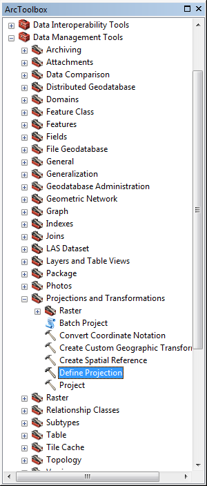
This will fix the map so all layers are aligned now, but for future use we are also going to assign the DRAWJTC layer a projection. Hit the red toolbox button to open the ArcToolbox dialog. Then navigate to Data Management Tools -> Projections and Transformations -> Define Projection.
Now select the DRAWJTC layer, and then select the same projection we just imported (it should show up in the favorites now). Make sure to select the meters projection, not the feet one.

Next the dbf file you imported, HomeOff_Troy.dbf, has both the XY coordinates for the home locations (in the X_METERSH and Y_METERSH fields) and the offense locations, (X_METERS and Y_METERS). Right click on the table and select Display XY data twice, one layer for the home locations and one for the offense locations. When you do this the default projection should be the correct one that the map is current in, but if it is not go through the same dialog as previously shown and select the same prj file. The screen shot below shows the dialog for the home locations.

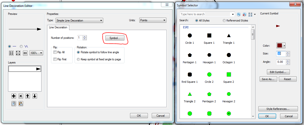
To make the home and offense locations clear I styled the offense locations as bright red circles, and the homes as dark blue squares. I then colored the JTC trips as dark brown. Now we are going turn the lines into arrows. Click on the line symbol in the table of contents for the DRAWJTC layer. Then click Edit Symbol.

Next make sure that in the Type dropdown at the top that Cartographic Line Symbol is selected. (If you don’t have a line properties tab available, this is the likely culprit.) Then navigate to the Line Properties tab, select the second arrow option, and then click Properties.

By default the arrow head is black. Change it to the same dark brown color you used for the line by selecting the Symbol button (and then you will be in the familiar symbol selector dialog). Here I also make the font slightly smaller to 10 units.
Now hit ok several times to get back to the main map. Here is what my current map looks like.

Now we are going to make a set of small multiple maps. The process to insert multiple data frames is the same as before. But first we are going to organize our table of contents by grouping related layers together. First use Ctrl to select the three offender layers, then right click and select Group. This makes a hierarchy in the table of contents, where you can copy-paste or turn on/off several layers at once. Name this group Crime. Do the same process for the remaining layers and name them Background. Collapse the Background group.

Now insert two new data frames in the map. Name the data frames, Homes, Offenses, and JTC. Now select the two grouped sets of layers and copy-paste them to the new frames.

Your table of contents should now look like below.

Now navigate to the layout view of the map, and use guidelines to make each map the same size and aligned. Here I changed the size of the map to be 12 by 6. To get each map aligned, a quick trick is to right click on the Troy Outline layer in the table of contents and then select Zoom to Layer. This will align each map to the same location if each data frame is the same size.

Now insert titles to label each panel, and in one panel insert a north arrow and a scale bar. No legends are necessary if you label each panel. Here is what my finished small multiple map looks like.

For your homework, pretend that intelligence suggests Mr. Theft from Vehicle is active again. Based on his prior activity and current intelligence, you predict that the next place he will commit a crime will be around 115th St. and 4th Ave., and that prediction has an error of around 1 kilometer. Create a new point shapefile that has a point at the predicted intersection, then create a buffer of 1 kilometer around that point (see the prior weeks tutorial for how to create a buffer). Make a map zoomed into that predicated area, and have an overview map showing the entire city of Troy with an extent indicator of the zoomed in location. Turn this map in for your homework.