This will be a walk through of using GeoDa to conduct exploratory spatial data analysis of lattice data. The last tutorial was for point pattern datasets in CrimeStat, but lattice (or areal data) are sets of polygons that have associated attributes. For example counts of crime and estimates of the residential population for census tracts. You have already been introduced to areal data by making choropleth maps, but here we will go beyond making maps to assessing spatial relationships in the data.
GeoDa is a freeware tool that you can download currently at https://geodacenter.asu.edu/software/downloads. The GeoDa center at Arizona State University has many different resources as well, so it is a good website to browse for additional material. Unlike CrimeStat you have to install the software, but it is currently installed in many computer labs at SUNY Albany. You can download the geographic data we will be using for this week from blackboard, or from dropbox at https://www.dropbox.com/s/6xwts48cgdvpmoh/6_ESDA_wGeoda.zip?dl=0.
First open the GeoDa program, and you will be presented with a simple toolbar.
Now we want to import our spatial data. Here we will be using data from my dissertation looking at crimes at street units (street segments and intersections) in Washington, D.C. For more information on the data I compiled you can see my dissertation, or for some online maps you can see my supplemental material.
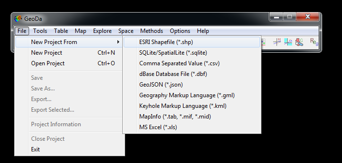
To import the data, go to File -> New Project From -> ESRI Shapefile (*.shp)
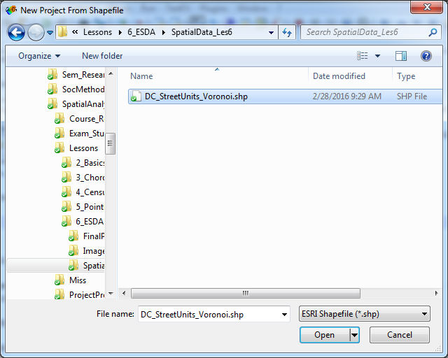
Select the DC_StreetUnits_Voronoi.shp file I disseminated to the class, and select Open.
It takes a minute to load up the data, but here is the map that pops up when it is finished.
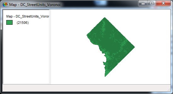
For what these areas are, I created a set of micro place “street units” - intersections and street midpoints across D.C. If you imagine splitting up the city based on those point locations, Voronoi polygons are one way to do it. It happens to be that any location within a polygon is always closer to the focal street unit than to any other street unit in the sample. Places with large Voronoi polygons means there are not many locations nearby. Examples where this occurs in places such as Rock Creek park, which have very few streets, or on bridges over Anacostia.
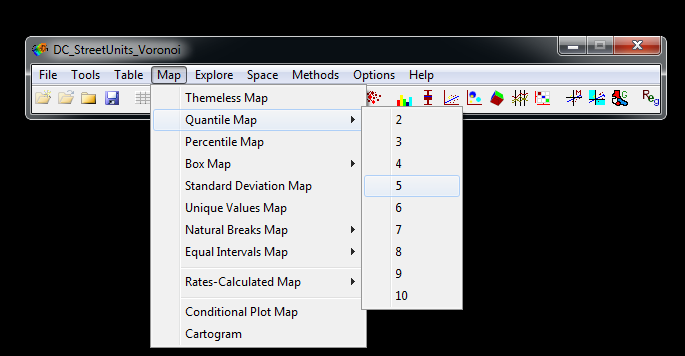
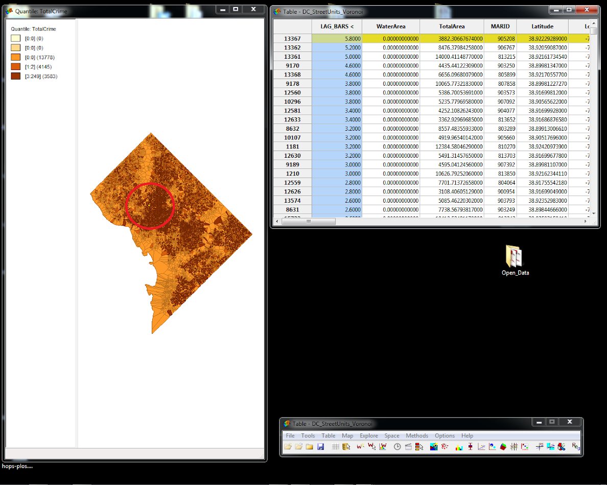
Close out of that map window. We are going to make a nicer map displaying the counts of Part 1 crimes (in 2011) at these micro places. In your file bar go to Map -> Quantile Map -> 5.
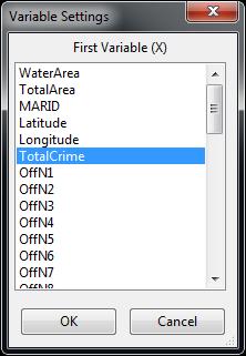
Then select the variable TotalCrime in the dialog and hit OK.
Now we get another small map of the quantiles. We can arrange windows and resize maps though, so hover the mouse over the lower right corner (circled in red below).

This will turn the mouse into a set of arrows pointing northwest and southeast, and then you can drag the window to be much larger. Here is mine when filling up the screen.

With the low count crime data, most places in the city have 0 crimes. This resulted in several of the bins being redundant in the legend, but it ends up producing a fairly nice map to visualize places with higher crime counts. Notice the highest bin though is only 3 part 1 crimes during the whole year.
The power in GeoDa is not simply making maps (which so far could easily be created in ArcGIS), but in creating a set of interactive plots and the ability to explore spatial relationships. Spatial relationships though are defined via the spatial weights matrix. Geoda has some very nice tools to create spatial weights and explore them.
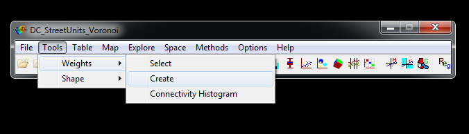
In the File Menu go to Tools -> Weights -> Create.
In the weights file creation dialog that pops up, select MARID in the dropdown as the file id variable, and then select Queen contiguity as the weight type.
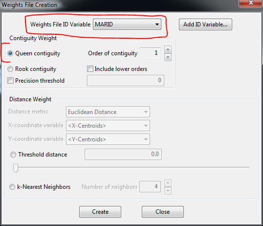
Click create, and save the gal file as Queen.gal. You will then have a pop-up that says the file was successfully created. Click OK for the success pop-up, and then in the weights file creation dialog click the Close button.
Queens contiguity means that any polygon that touches the focal polygon is a neighbor. The resulting GAL file is simply a text file, so you can open it up in any text editor and see its format. Here are the first 5 lines of the file.
0 21506 DC_StreetUnits_Voronoi MARID
805688 10
812852 811716 800366 901057 900925 802288 810097 903190 808572 902784
804830 4
812846 900274 809814 804085
So the first line is a special header that defines the number of units with no neighbors (0 - so all units have at least one neighbor), the total number of units in this file (21,506), the original spatial file it came from, and the variable name (MARID). The subsequent lines define the neighbor format. So the second line says that for spatial unit 805688 it has 10 neighbors. Then on the following line it lists the ID’s of those 10 neighbors. It then does this for all 21,506 spatial units.
Using that same dialog you can create other types of spatial weights matrices. It has all the regular matrices used in spatial data analysis; contiguity, distance based, and k-nearest neighbors. It is important for subsequent analysis that every point have at least one (preferably more) spatial neighbors. It is also important that the variables not have any missing data. In either of those cases, the subsequent spatial operations such as a spatial lag are not well defined.
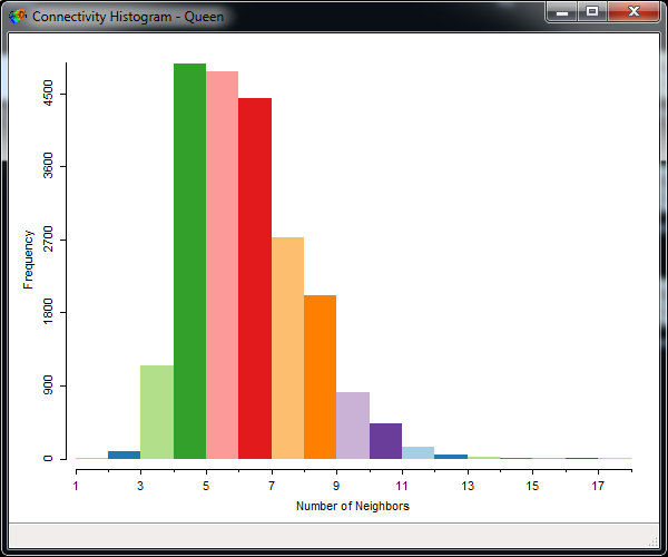
We can see how many neighbors spatial units have by going to Tools -> Weights -> Connectivity Histogram.

This brings up a nice histogram that shows the majority of the units have between 5 and 11 neighbors. There are no locations with zero neighbors, so this spatial weights matrix would be fine for subsequent analysis.
One of the coolest things about GeoDa is that all windows are linked to one another. So if you want to see what spatial locations have a particular number of neighbors, select a bin in the histogram and see what happens in your Quantile map that you previously created.

They are all linked, so you can select certain data attributes and subsequently see their spatial locations. You can also do the opposite operation (select certain spatial locations) and see there data attributes in certain plots. To clear any selected objects click anywhere in the plot or map outside of bars/points/polygons.
For the next part, we are going to use a k-nearest neighbor spatial weights matrix instead of queens contiguity. Mainly because interpretations of spatial lags are simpler (also I noticed several errors in GeoDa’s creation of the queens spatial weights matrix for this example, so it pays to check!). So go back to the file menu Tools -> Weights -> Create and select the K-nearest neighbor dialog. Then select the 5 nearest neighbors (note the default is 4). I subsequently saved this file as K5.gwt. The gwt format is still plain text, but has a different format.

If you go back are redo the connectivity histogram with this spatial weights file, you will see that all variables have 5 neighbors. This type of weights matrix is not only simpler to interpret (as will be shown) but can be useful with discontinuous or highly irregular data so all points have an equal number of neighbors.
Now that we have created a spatial weights matrix, we can do an operation called calculating a spatial lag. The file currently contains variables like the number of bars in that street unit (TypeC_D). Here we will calculate the total number of bars in the neighboring street units - where “neighbors” are determined by our spatial weights matrix.
Go back to our file menu and then select Table -> Variable Calculation.
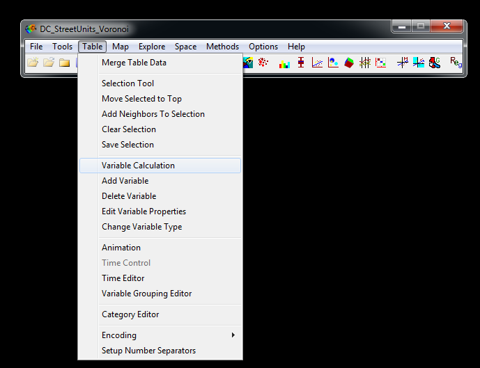
On this new dialog navigate to the Spatial Lag tab, and you will then be presented with a dialog as below.

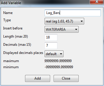
Click the Add Variable, button. In this dialog that pops up name the variable Lag_Bars and keep all of the other defaults (as shown below), then select Add.
You will then be back at the prior dialog. In the Weight drop down, make sure to select the K5.gwt weight file, and then in the variable dropdown on the right select TypeC_D. This stands for Type C and D alcohol licenses in D.C., which happen to be bars that you can consume alcohol on premises (as opposed to alcohol licenses to sell beer - like at a gas station or liquor store - that need to be consumed off-premises). This will then populate the text box as below. Again make sure that you selected the second K5 weight that we calculated.

Click apply, and then click close. Now in the file menu, click on the Table icon (highlighted in red), and this will bring up a datatable of the values.
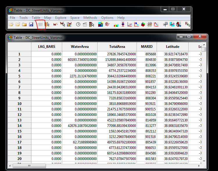
The variable we just created, LAG_BARS, will be at the left most portion of the table. Double click on the LAG_BARS field twice to sort the table in descending order. You should end up with ID #13367 at the top (MARID 905208) with an estimate of 5.8 for lag_bars. Click on the ID number and it will select the entire row. It is hard to see but this also highlights one area in our quantile map (circled in red).
Now navigate to the map window. We are going to zoom into this selected location. Right click anywhere in the map area, and toggle zooming mode on (highlighted in red below).
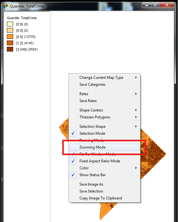
You will then have a magnifying glass, and the same as in ArcGIS you can select a rectangle to zoom into. Zoom into the selected area. Next, in the file menu go to Table -> Add Neighbors to selection. You can see my map on the left before the selection below:
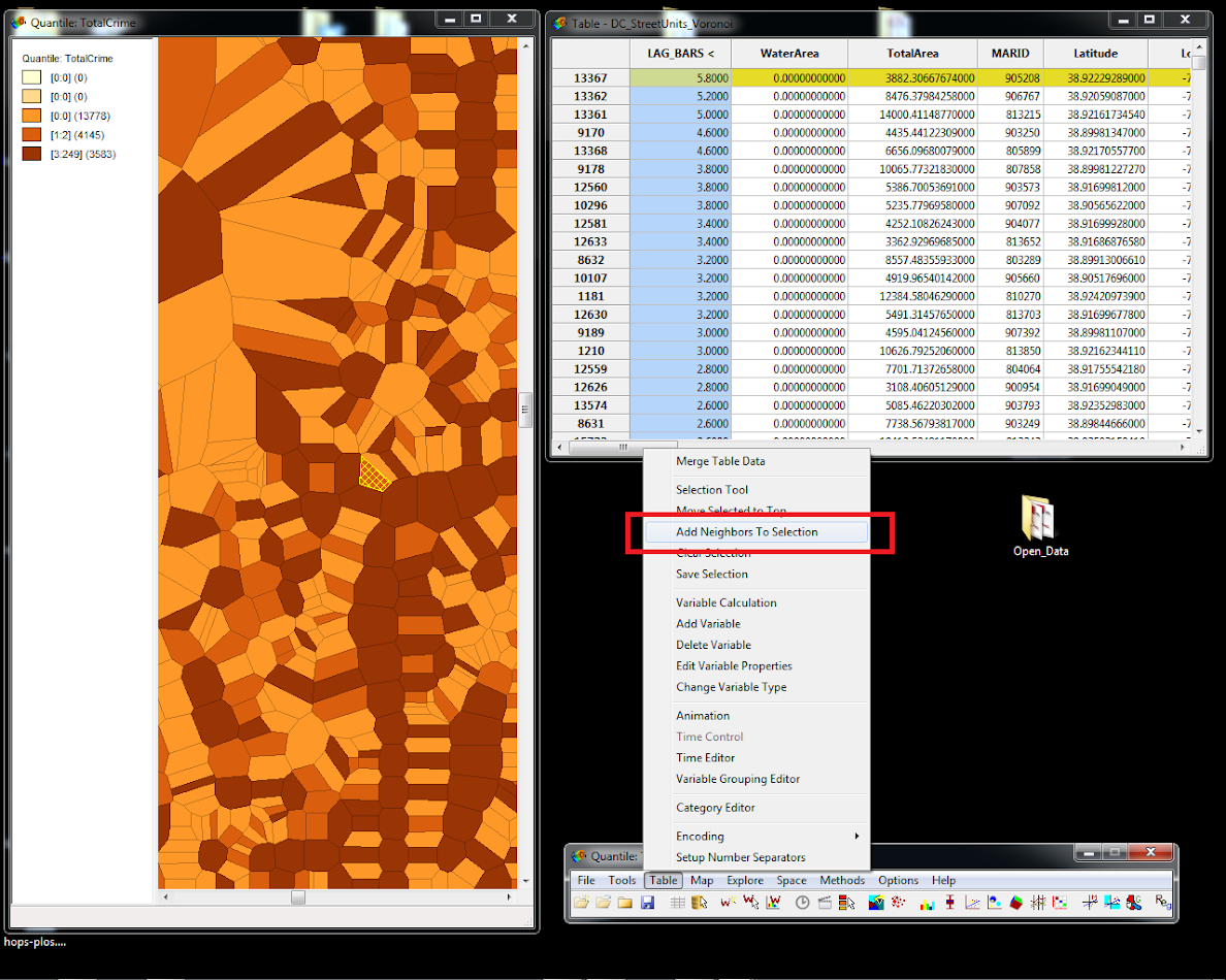
After you hit Add neighbors to selection, go back to the file menu, and then select Table -> Move Selection to Top. After I did this, I deselected the original 13367 unit, and below you can see I have selected the 5 other neighboring units. I also dragged the original TypeC_D variable to the left hand portion of the table.

To see where the spatial lag of 5.8 came from, add the number of TypeC_D licenses in the 5 neighbors of 13367. These add to 20 + 0 + 3 + 0 + 6 = 29. GeoDa by default calculates the lags as row-normalized, so with 5 neighbors it will be the (sum of neighbors)/5. So 5.8 here equals 29/5. This is one reason why k-nearest neighbors spatial weights are easier to interpret than weights that have an irregular number of neighbors. I will show how interpreting regression slopes is also simpler in some circumstances.
Moran’s I is a global statistic that measures the amount of spatial-autocorrelation in the data. This ends up being very similar to the a normal correlation coefficient, just instead of two separate variables, it is the correlation between the local variable (crime on this street unit), and the spatial lag (crime on the neighboring streets).
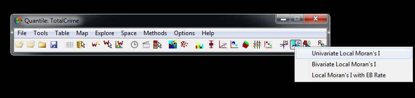
In the file menu bar, select the option shown below, and then click Univariate Local Moran’s I.
In the select weights dialog that pops up, make sure to have your K5 weights selected, check the set as default dialog, and then hit ok.

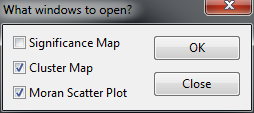
In the following what windows to open, select both the cluster map and the Moran scatterplot.
Now you will get two windows that pop up. The scatterplot shows the Z-scored total crime on the X axis, and the spatial lag of the Z-scored total crime on the Y axis. The slope of the line shown is global Moran’s I coefficient, which is just under 0.12. You can see most of the data are bunched up.
In the local scores maps, it shows significant pairs of locations based on 99 permutations. In interpreting the pairs, the first variable is the local value, and the second is the neighbor value. So a pair of Low-High means it is a location of low crime next to a location of high crime. Most maps tend to be dominated by Low-Low and High-High pairs, but crime is not as smooth as some other types of spatial data. E.g. high crime locations are often right next to low crime locations, and high crime neighborhoods often have a mix of low crime and high crime micro places.
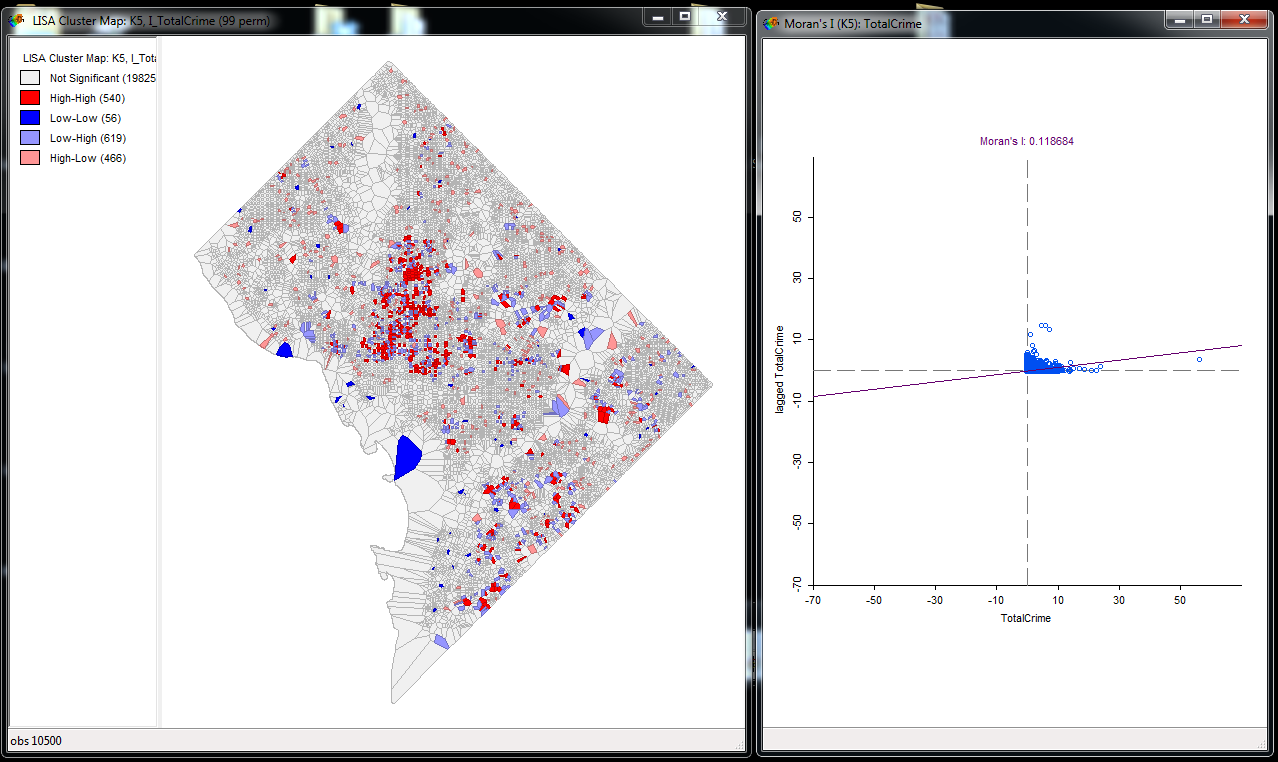
You can select either portions of the scatterplot or different items in the legend. Here I selected the pink High-Low areas. That is, areas that have high amounts of crime and low amounts of crime in the neighboring street units. You can see in the scatterplot these just end up being places that have some crime, but the neighboring street units have zero crime in total (they hug the X axis).

Personally I have never found the cluster map to be real useful, the scatterplot is good at identifying outliers though.
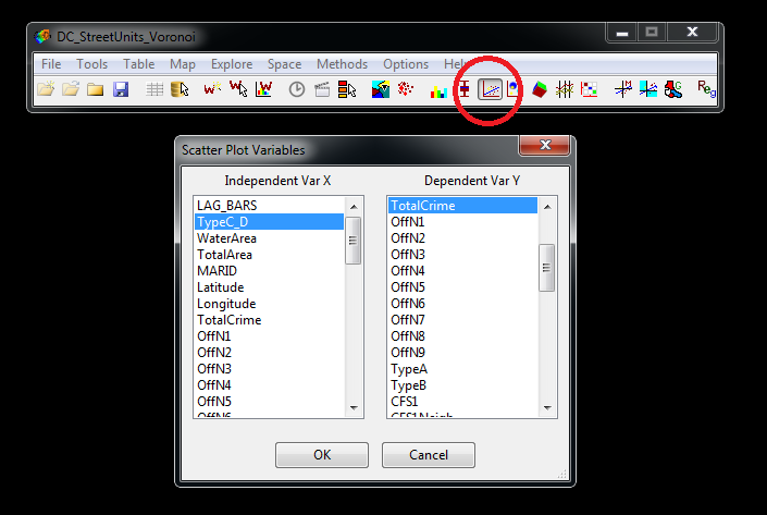
GeoDa also has many tools to assess bivariate relationships between two separate variables. Here we are going to evaluate the effect of the number of local bars on crime, and compare it to the effect of neighboring bars on crime. So first, in the Menu Bar click the scatterplot icon (circled in red below). Then select TotalCrime for the Dependent Y variable, and TypeC_D for the independent variable and hit ok.
This will produce a new window with a scatterplot and some linear regression information. Go ahead and do the same for the the LAG_BARS variable we just created. Below is a screenshot of both those scatterplots side by side.

Now to interpret these equations. For the TypeC_D effect (the local number of bars) we have a slope coefficient of 2.8. This means that adding one bar to a street unit increases the number of Part 1 crimes on average by 2.8 per year.
For the LAG_BARS, we have a slope coefficient of just under 4 (3.97 to be exact). Although the coefficient is larger than the local effect, remember that the LAG_BARS value is the average per the 5 neighbors. So increasing 1 in lag bars is the equivalent of having 5 bars in the neighboring areas. The effect of only 1 bar in the neighboring areas is 0.2*5 = 1.
So we can have two different perspectives. Say you are a home-owner concerned about zoning for new bars. These equations would suggest that if a bar comes onto your street, you would expect Part 1 crimes to increase by almost 3 per year. If the bar was on a neighboring street, crime on your street would increase by 1 part 1 crime per year.
There is an opposite perspective though, in that if you add a bar how much does the total amount of crime increase. We know that it increases by around 3 on the local street, but one bar will diffuse crime increases to multiple neighboring streets. While the k-nearest neighbor is not necessarily symmetric, for example consider a spatial set of locations ABC D. The two nearest neighbors of D are C and B, but the two nearest neighbors for C are A and B. So the neighbors are not necessarily symmetric if the areal units are not a regular grid. But a point will on average have around 5 neighbors, so the local effect of one bar will be 2.8, and the cumulative neighbor effects will be 5*0.2 = 1. So from these bivariate models we might guess that bars increase crime by a total of around 4 part 1 crimes. These marginal effect estimates work similar to spatial weights matrices that have an irregular number of neighbors as well - just use the average to get a quick and dirty estimate.
This is a simplistic assumption, because we have estimated these effects separately, and the count outcome of crime is not quite appropriate to use linear models. Next week we will talk about fitting spatial regression models, but interpreting spatial lags like here will still come into play.
Note if you want to export these images, you can right click on the image and select save as in the bottom dialog box. (Ditto for maps.) Also with these scatterplots you can edit whether the regression coefficients are shown below the scatterplot. By default it shows the global regression, as well as the regression if you select a subset of spatial locations.
For your homework, use the same DC data. First create a new spatial lag variable based on CFS2. These are 311 calls for service related to detritus complaints at street units (e.g. garbage on the street). Create scatterplots of the local variable (CFS2) and the spatial lag (CFS2_Lag), and export those two scatterplots to PNG files. Create a word document and import those two scatterplots into the word document. Then in the word document write a few sentences interpreting the two slope coefficients.
For 5 points extra credit, create two maps, one of the Total Crimes and one of the Calls for Service. Export both to PNG files and include them in your homework document. Write a few sentences describing the spatial patterns you see for the two variables.