This weeks tutorial illustrates how to conduct two of the types of point pattern analysis discussed in class this week: near-repeat analysis and Andresen’s spatial point pattern test. Each uses a different tool to conduct the analysis, but I also show how to incorporate the work with ArcMap. The data for each tutorial can be downloaded from blackboard, or from this link. The zip file also includes the tools for this homework.
As a note, there is a newer tool, created by Liz Groff and Travis Taniguchi, to conduct near-repeat analysis that can incorporate network distances (so distance between points on a street network). It will likely work for larger point patterns as well (Jerry’s calculator seems to not work out very well for any more than 5,000 points). I will eventually redo this tutorial using that software, but for now you get the old calculator that Jerry created.
The app used to conduct Andresen’s spatial point pattern test also does not incorporate some of the advances I proposed to the methodology in A. Wheeler, Steenbeek, and Andresen (2018). To do those you need to use the R package, which I will show in a later tutorial in the class how to use R.
This is an additional walk-through about how to conduct near-repeat analysis, as discussed in Ratcliffe and Rengert (2008). It also contains an example of taking what are originally data in latitude and longitude (spherical coordinates) and adding fields that are projected into the spreadsheet. This is a necessary step to perform many different types of geographic procedures (such as calculating buffers, or accurately estimating the distance between two points). I illustrate this with an example of over 2,800 shootings in Philadelphia from 1/1/2015 through 4/25/2017.
The shooting and Philadelphia boundary data were originally obtained from https://www.opendataphilly.org/. Jerry Ratcliffe’s Near-Repeat calculator can be downloaded from http://www.cla.temple.edu/cj/resources/near-repeat-calculator/. But I also link to this data at the beginning of the tutorial and provide the data on blackboard as well.
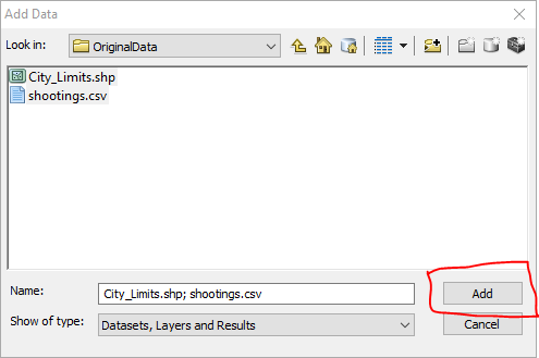
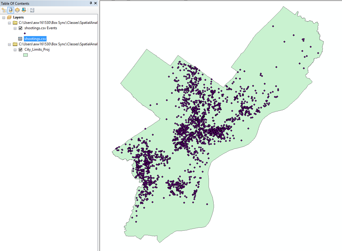
Create a new map document, and then add in the csv data “shootings.csv” as well as the “City_Limits_Proj” shapefile.
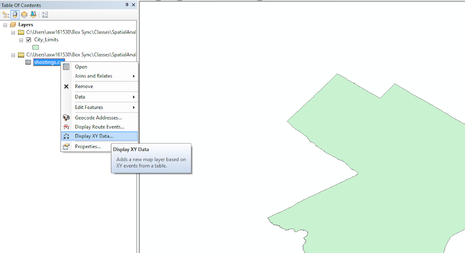
In the table of contents, right click on the shootings.csv table and select Display XY Data.
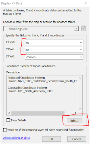
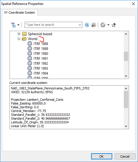
In the X field select lng (for longitude) and in the Y field select lat (for latitude). Now, before clicking ok, the default projection information filled in is based on the map, which happens to be a State Plane coordinate system in meters. We need to change this though, as the data are not projected, but are in spherical latitude and longitude coordinates. So after the X and Y field information is filled in, click the Edit button, circled in red below.
You will then get a Spatial Reference Properties window. Navigate to the top and collapse all of the folders to look like below.
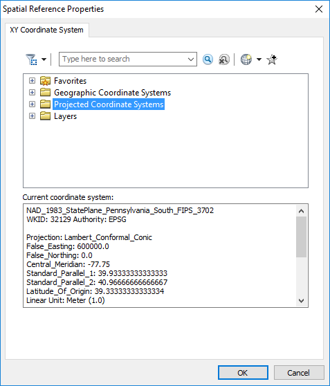
Now when you have latitude and longitude data, the data are not really projected at all. There are different reference systems though that define where exactly the latitude and longitude coordinates line up exactly on the globe. The currently most common one is named WGS 1984. It is currently the most common as that is what all web mapping software uses. So to assign the latitude and longitude points to WGS 1984, open up the folder Geographic Coordinate System -> World and then select WGS 1984 and hit OK. The next three screen shots below illustrate this.1


You should be back at the Display XY data dialog, and it should look like below.
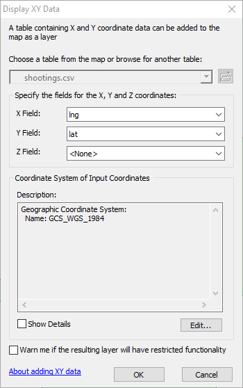
Now hit ok, and you should see the shooting locations populate on your map.
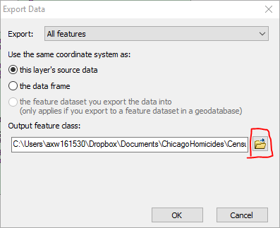
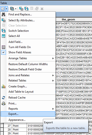
Now before we can move onto the next part, I need you to export the point data into a new shapefile. Right click on point layer that has the default name “shooting.csv Events”. (Do not right click on the original “shootings.csv” file.) Then navigate to Data and select Export Data.
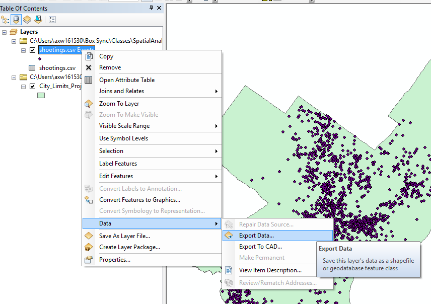
Then click the little folder icon to specify where to save the new file.
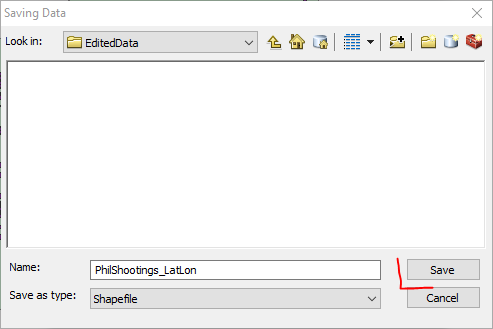
Navigate to a folder where you want to save the shapefile. (What I do for each lesson is make a new folder for “edited” data and maps.) Make sure the “Save as type:” option on the bottom is Shapefile, and then name the file “PhilShootings_LatLon” and then click Save.
Then you will be back at the Export Data window, and now you can click OK.
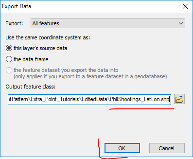
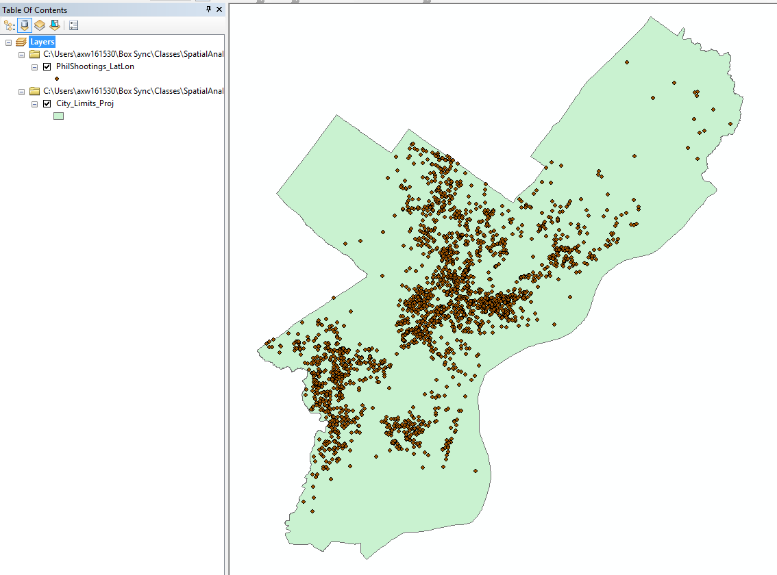
You will then get a pop up that asks if you want to add the exported data into the map. Click yes, and you will then see a new layer in your map. Get rid of the old shootings layers and original csv table by right clicking those layers and selecting Remove. In the end your Table Of Contents should look like below.
For some things you do it is necessary to do this step before editing the data or doing other processes. For example if I imported a spreadsheet of school locations and I wanted to created buffers around those schools, I would need to export the data to its own shapefile first. It is also necessary to be able to edit data fields, which we will be doing next.
To use the near-repeat calculator we need projected fields though - not latitude and longitude. Operations such as buffers and other spatial operations that rely on calculating distances you should really use projected data as well. So for your final project if you have point crime data in latitude and longitude, probably one of the first things you will do is find a suitable local projection and project the data into those coordinates.
Right click on the PhilShootings_LatLon layer and select Open Attribute Table.
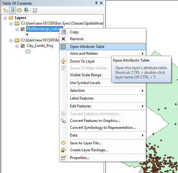
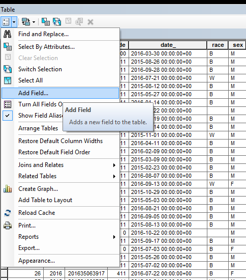
Now you should see that the database just has latitude and longitude coordinates. We are going to add in XY coordinates in a local projection. In the top left corner of the table select the list like icon and then select Add Field.
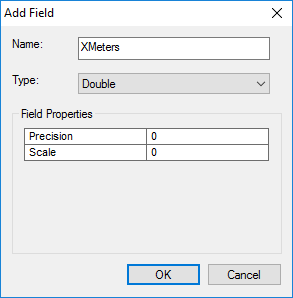
Name the field “XMeters” and change the Type to Double.
After you click OK you should then see your empty XMeters field at the end of the data table. Right click on the field header, marked with a right rectangle below, and select the “Calculate Geometry” option.
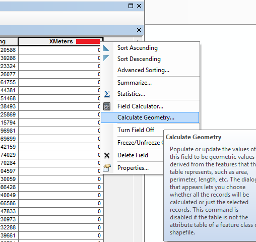
In the pop-up for Property, select the X coordinate of Point, and in the Coordinate System section select the button “Use coordinate system of the data frame:”. Then in the units selection, select Meters. Then hit ok. You should now see the XMeters field has coordinates above 800,000.

Repeat these same steps to add a YMeters field. You should then see coordinates that around under 100,000 meters in this projection. Now we can export this data to a csv file that we can use with the near-repeat calculator.
In the top left select the same list like icon you used before to add a field, but this time select Export.
This should look familiar. Click the little folder to select where you want to save the data. (It should default to the same location you just saved the shootings shapefile.) Now in the Save as type option on the bottom select Text file. This actually saves it to a csv file format, so you can change the name to have “.csv” at the end. Here I name it as “Shoot_XY_meters.csv”. Click save and then click ok. This time when the pop up asks to add the new table to the current map you can select No. Save your mxd map document, and then you can close that file.

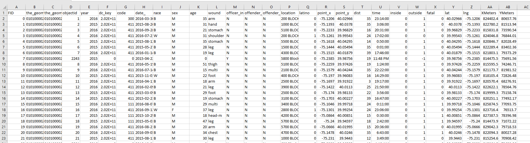
To use the near-repeat calculator, you need to have your data formatted in a very specific way. The current csv file we have will not work. It needs to be formatted as x,y,Date - and I believe the dates need to be in the “MM/DD/YYYY” format. So first we need to double click on our “Shoot_XY_meters.csv” file, which on my system opens in up in Excel (you could use any opensource spreadsheet software though it you wanted for this part). Here is what that file looks like.
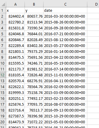
Here I am going to delete all the fields except for “date_”, and the XMeters, YMeters fields we just added. Then I reorder the fields so it is like I stated before, x,y,Date. Here is what the spreadsheet looks like now.
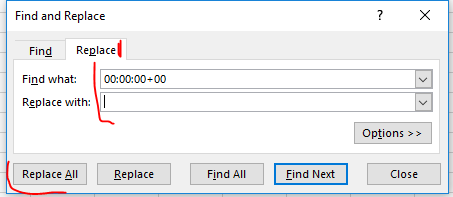
Now to transform the date field I am going to use Find-and-Replace and get rid of the extraneous hours:minutes:seconds field. Select the C column, and then on your keyboard hit “Ctlr” and “F” and the same time. This brings up the Find and Replace window. Select the Replace tab, and then in the find section type “00:00:00+00”, and leave the replace with section empty. Then hit Replace All.
After that, you should see that Excel automatically figured out to format the field as a date field. You can now hit “Ctrl” and “s” to save the csv file. Excel will warn you about keeping that file format, click Yes to save the work. You can now close out of your spreadsheet, the data is ready for the near-repeat calculator. (Excel will ask you to save it again, click Don’t Save, as it continues to harass you about the csv file format and you have already saved the contents.)
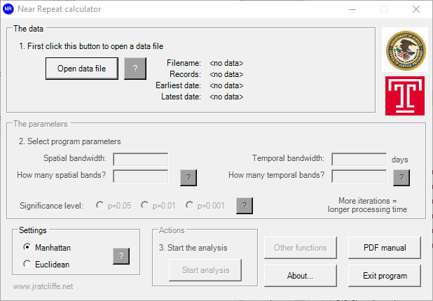
Now before you use the Near Repeat calculator you need to install it on your system. Unzip the “Near-Repeat-Calculator.zip” file, then in that folder navigate to Near-Repeat-Calculator -> Near Repeat Calculator, and then select the “SetUpNearRepeats.exe” file. This will install the NearRepeat utility on your system. Once that is done, open up the Near-Repeat calculator. You will get a screen that looks like below:
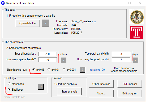
Click the Open data file button, and then import your “Shoot_XY_meters.csv” file. For the pop up about data’s distance, then select Meters. Now we need to fill in the parameters for the spatial and temporal bins you want to check. This depends on theoretically how long you expect to see near-repeat patterns (in both time and space) and the temporal divisions you care about. Ratcliffe and Rengert (2008) use spatial bands of 400 feet up to 4000 feet, and temporal bands of 14 days (up to 56 days). So we will do a similar distance of 200 meters, but I want to check for smaller temporal periods. Here I will use 3 days, up to 21 days. To make it quicker, set the significance level to p=0.05, and also set the settings box to Euclidean. (Manhattan would only make sense if the streets were in a perfect grid.) Your near-repeat calculator should then look like below.
Now hit start analysis, and it only takes a few seconds to complete the simulations. You will then have a html file automatically open up, and it has a nice table of the results. (It saves this html file in the same folder that the “Shoot_XY_meters.csv” file is located in.)
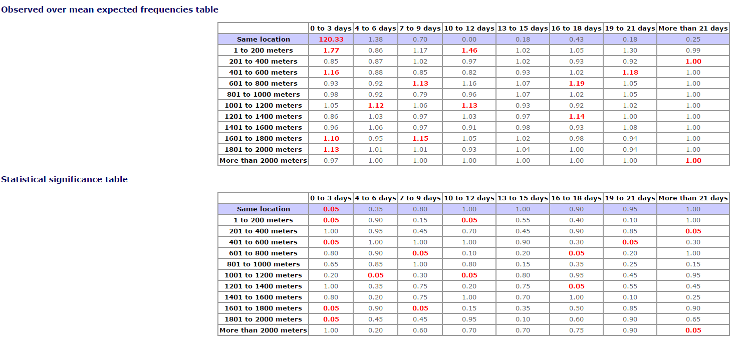
Here the same location within 0-3 days has a very high level of near-repeats. There are a few other patterns, but they are not temporally or spatially consistent.
Whether exact same repeats can even occur in the data depend on how the data is recorded. If you use sensor data, like ShotSpotter locations (Loeffler and Flaxman 2016), you wouldn’t ever expect to have exact repeats. But if you are just using the nearest address - which is common for most police departments, you can have two at the exact same location just due to the limited specificity of the geocoding engine.2
Andresen’s spatial point pattern test is a test in the relative proportion of incidents that occur in different areas between a base dataset and a subsequent test dataset. For a simplified example, imagine you have three areas, A, B and C. In 2010, you have 100, 500, and 400 burglaries in each area in 2010, which results in 10%, 50%, and 40%. Now in 2011 say the counts in the three areas are 80, 320, and 200. Which results in the percentages of 13%, 53%, and 30%. We can see that crime went down in the 2011 sample, but we want to test whether the relative percentage in each area changed significantly. E.g. we are comparing 40% for area C in 2010 compared to 30% for sample C in 2011. Is that a significant change, or would drops in percentages that large simply happen by chance?
To do this Andresen’s point pattern test treats one of the samples as fixed (the base dataset), and the for the other draws a bootstrap sample of the original points to estimate a 95% confidence interval for the percentage.
Martin has posted a variety of examples of using this test on this webpage. Examples include:
And I’m sure you can think of some more potential applications ;)
Those examples are for both larger neighborhood areas, like census tracts, or for smaller areas like street segments. Here I am going to go over using the tool Nick Malleson created to conduct the spatial point pattern test. The tool can be downloaded here. I will go through an example of seeing if 311 calls for service overlap with Part 1 crimes in Washington D.C. at a grid cells of 500 by 500 meters. See A. P. Wheeler (2018) for some background on the dataset and 311 calls for service. (I took out parking meter complaints and bulk pickups from this dataset, but kept in other complaints that I dropped from my Crime & Delinquency paper.)
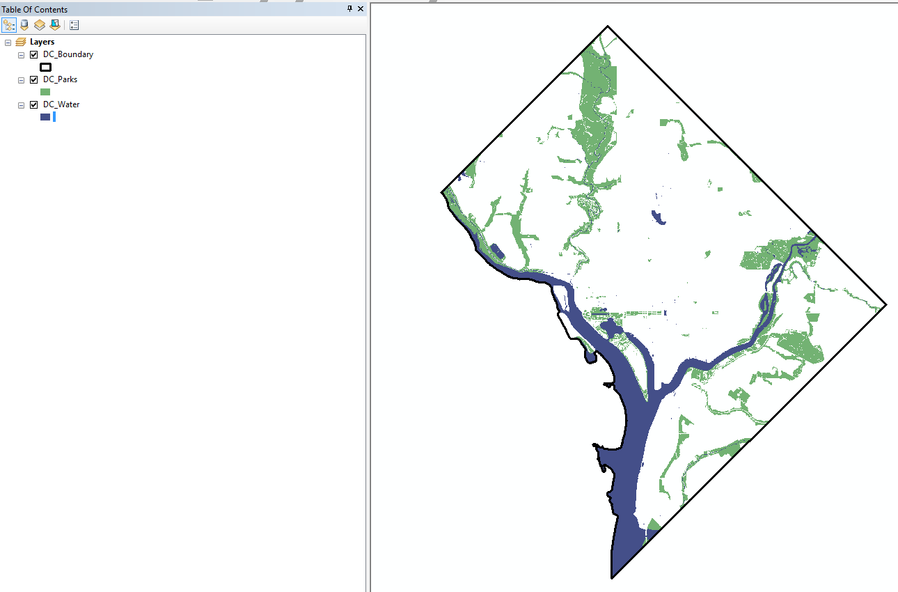
In the data I have provided two point datasets, 311 calls for service (in 2010), and Part 1 crimes (in 2011) in Washington, D.C. I have also provided the outline boundary of D.C., its rivers and parks are polygons. These aspects of the built environment will be important for understanding areas with very little crime.
First lets open ArcMap. Import the Boundary, Parks, and Water (you do not need to import the point pattern datasets, the 311 is large and can make ArcMap alittle slow). Make the boundary hollow and have a width of 2. Make the parks green and the water blue. Make sure the boundary file is towards the top of the table of contents (so over the water and the parks). Here is what my map looks like after those edits:
Now if you had areas of interest (like census areas or police areas), you could use those for the point pattern test. Often when conducting analysis of point patterns it is convenient though to use an arbitrary grid and aggregate points to that, what is sometimes called quadrat analysis. Here I am going to show how to make that “Fishnet” grid in ArcMap.
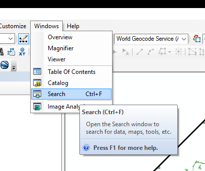
In the main file menu, select Windows, and then select Search.
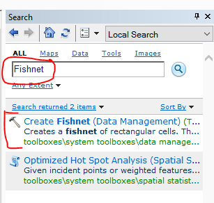
Now in the the search bar type “Fishnet” and hit enter. You should have a tool called “Create Fishnet” in the results.
Click that tool, and in the dialogue that pops up select where to save the output. I name mine Fishnet_DC_500m.
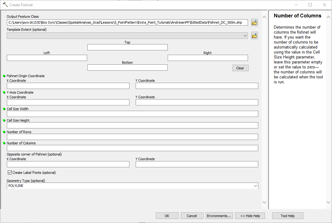
In the Template Extent dropdown you have the option to select where the boundaries of the fishnet are based on one of the other layers. Select the DC Boundary, and then you will have all that info on where the origin box should start.

Now I want to fix the size of the grid cells to be 500 by 500 meters. To do this, I set those parameters in the Cell Size width and Cell Size height boxes. (These will be in the same units as the current map.) You don’t need to worry about the opposite corner stuff, ArcMap will automatically make the fishnet bigger, so no cells are cut off in size. Finally I unselect “Create Label Points”, and I change the Geometry type to POLYGON.

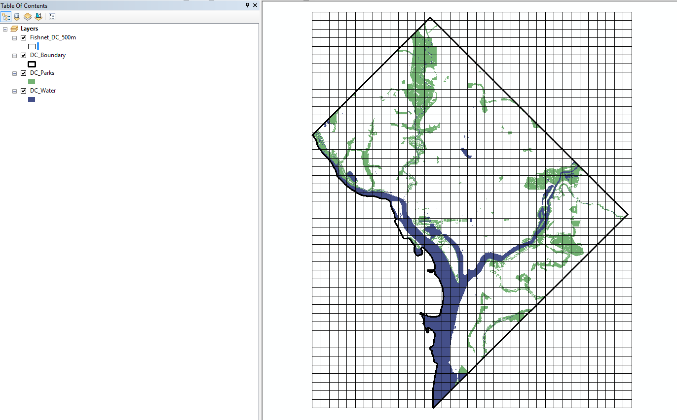
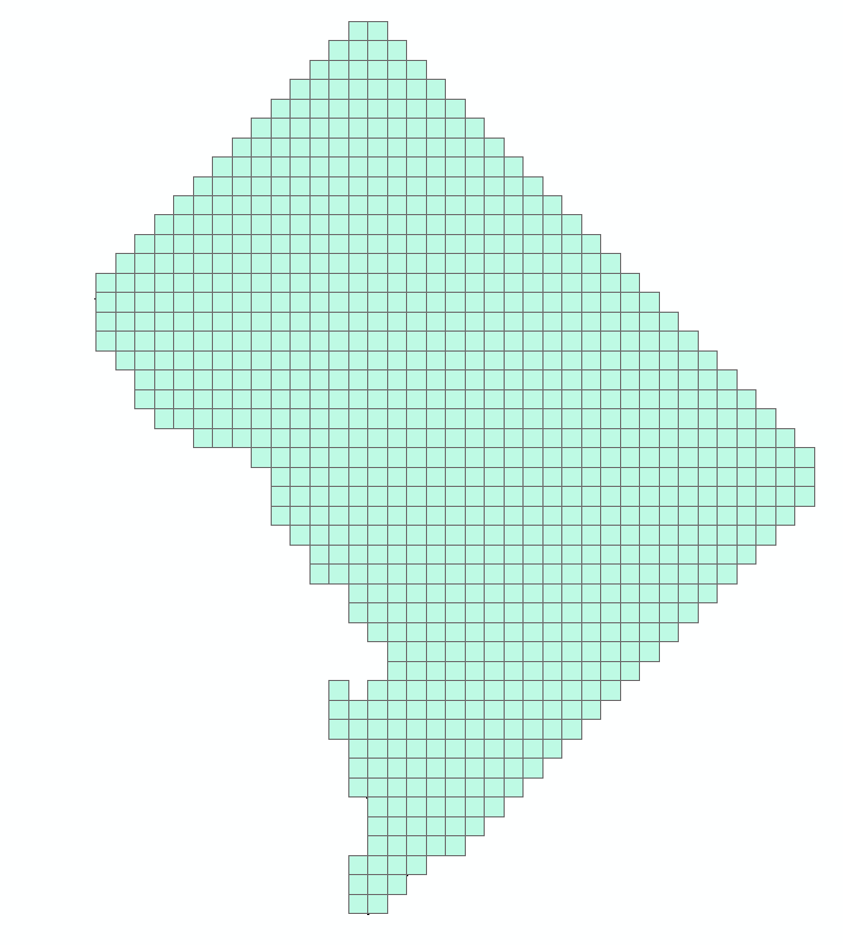
After that is all set-up, go ahead and click OK. ArcMap will then churn out a regular grid over the study area for you. Make the fill hollow so you can see the stuff underneath it. Here is what mine looks like.
Now because DC is not a perfect square, we have a bunch of irrelevant grid cells. We are going to select these out. On the file menu go to Selection and then choose Select by Location.
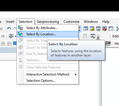
Then in the dialogue in the select features from choose the fishnet layer, and in the source layer select the DC boundary. Make sure the bottom option is “intersect the source layer feature”. After all those options are the same, go ahead and hit OK.

After that you should see the usual cyan selected features, but only those that are on top of DC. Now in the table of contents right click on the Fishnet layer. Go down to data, and then select Export data.
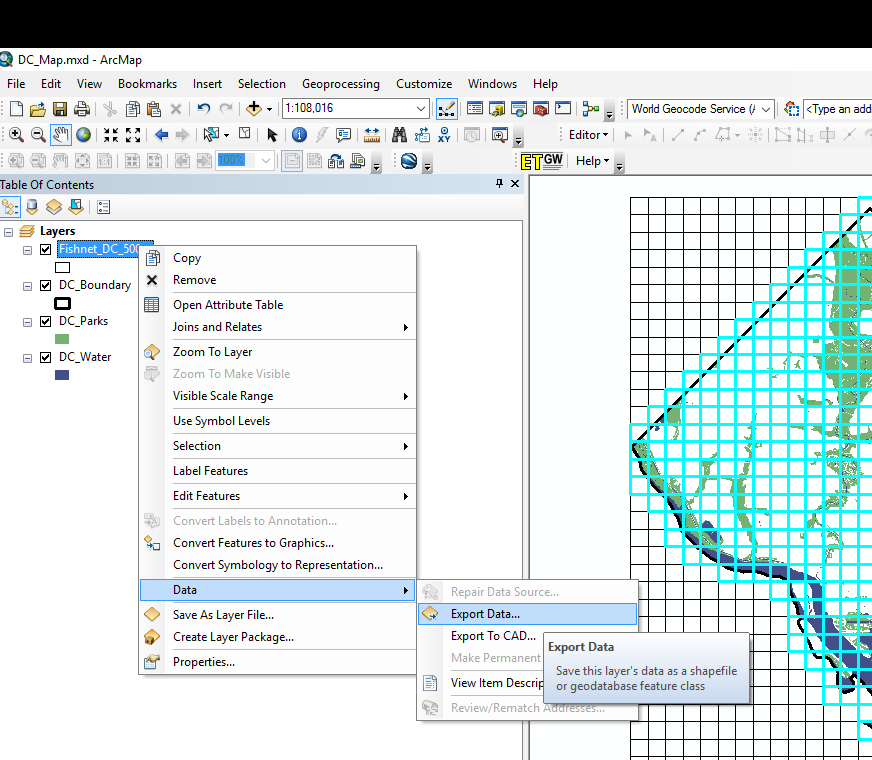
By default, the export option at the top should say “Selected Features” (if it doesn’t change it to this). Choose where to save the data. Here I named it Fishnet_DC_500m_InBound. Then go ahead and click ok.

You can go ahead and click OK to add it back into the map. Remove the original Fishnet grid by right clicking the layer in the table of contents and then selecting remove. We now have our regular grid of 817 polygons over DC.
Now the fun part. After you have downloaded Andresen’s point pattern tool, unzip the file and navigate to the folder named dist. You will then see a few files, one of which is run.bat. I believe you need to run this bat file once to download the necessary java libraries. Then after that you can simply double click on the AndresenSpatialTest.jar file to open the application. (Note I’ve had problems on Windows machines not knowing where java is before. If that is the case you need to add the path to where it is installed to your environment variables in Windows. If you don’t understand this or are having trouble, make sure to use the discussion forum to ask questions!)
When you get the tool running it should look like this when you first open it:
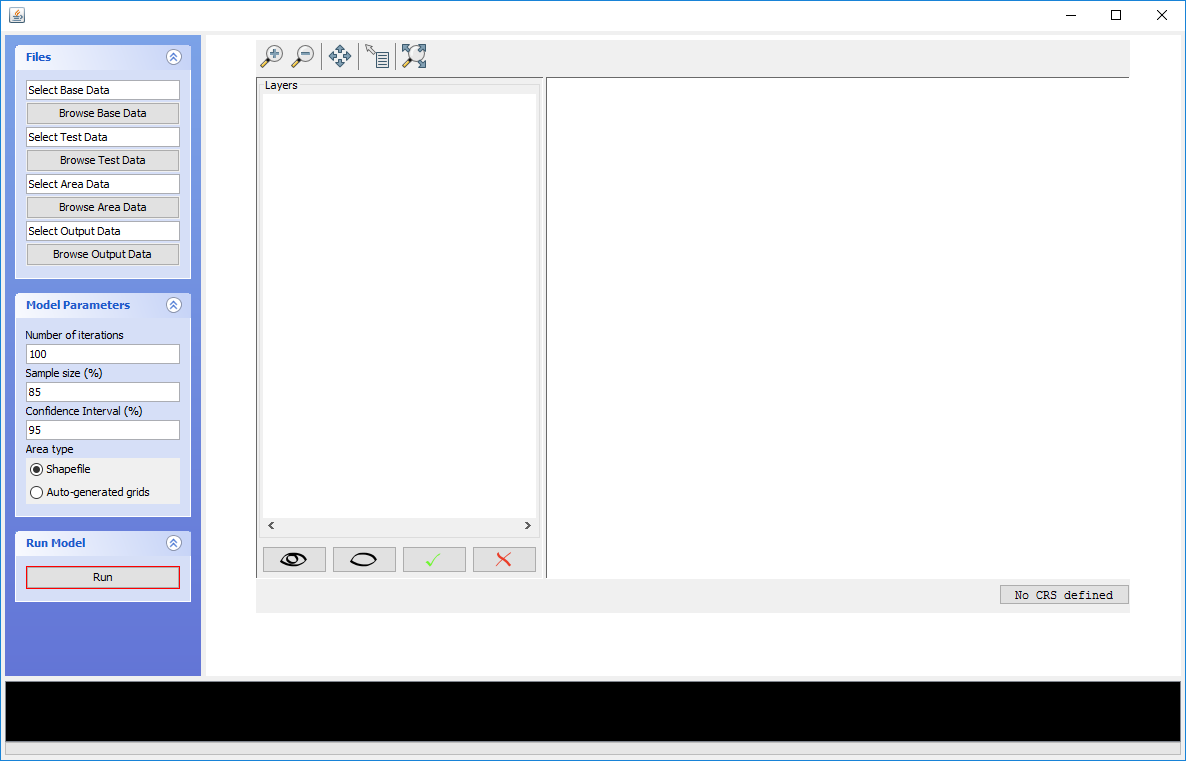
Now importing the files is pretty straightforward. For the base dataset choose the 311 calls shapefile, and for the test dataset choose the crimes. (See some discussion at the end for what should be the test and what should be the base.) For the area data choose your subset of the fishnet. In some instances I’ve had the application read the CRS, and sometimes not. You can set it to NAD Maryland if you want, but it does not make any difference for the tool itself.
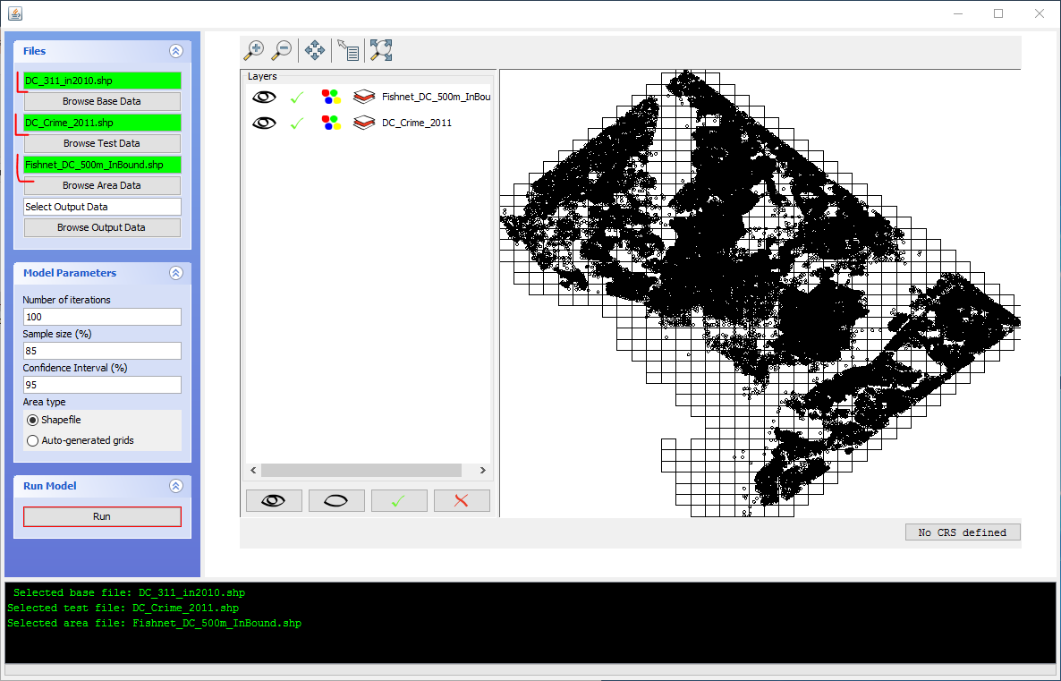
Now in the Select Output Data you can specify where to save and what to name the resulting file (it will make a new shapefile). Here I name mine AndRes_100Sim.
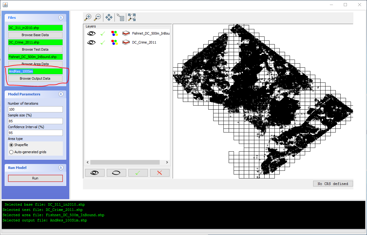
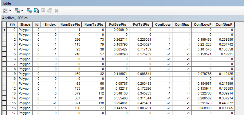
We can keep the other model parameters as the defaults. So go ahead and click the “Run” button in the Run Model area, and wait a few minutes for the simulations to get finished. You get a pop-up that says the model is running, and the ticker on the bottom shows what simulation run you are on. Even with these large of datasets (base set over 100,000, test set over 30,000) each simulation run only takes a few seconds. Once it is done, it will add a layer to the output and give you some stats. Here the global S index is just under 0.33, so that means only 33% of the percentages in the base sample are within the confidence interval for the percentages of the test sample. (See at the end for some discussion related to this statistic.)

We can go ahead and close out of the tool now. And head back to ArcMap. We are going to map our results.
Once you are back in ArcMap, you can add in the shapefile that Andresen’s tool output, here I named it AndRes_100Sim. Once that is imported open up the attribute table for that object. You will see several columns. You can probably figure out what most of them are. They are the number of points of the original two point patterns, the percent in each, the upper and lower confidence intervals of the percentage for the test sample, and several dummy categories related to whether the differences are negative or positive.
You can really map this information in a lot of different ways. You probably want maps of the baseline data percents for each type, and then a map of the significant differences. Here is a map where red are places where the crime percent is higher, and blue are places where the crime is lower. Here I use the SIndex field to map these categories.
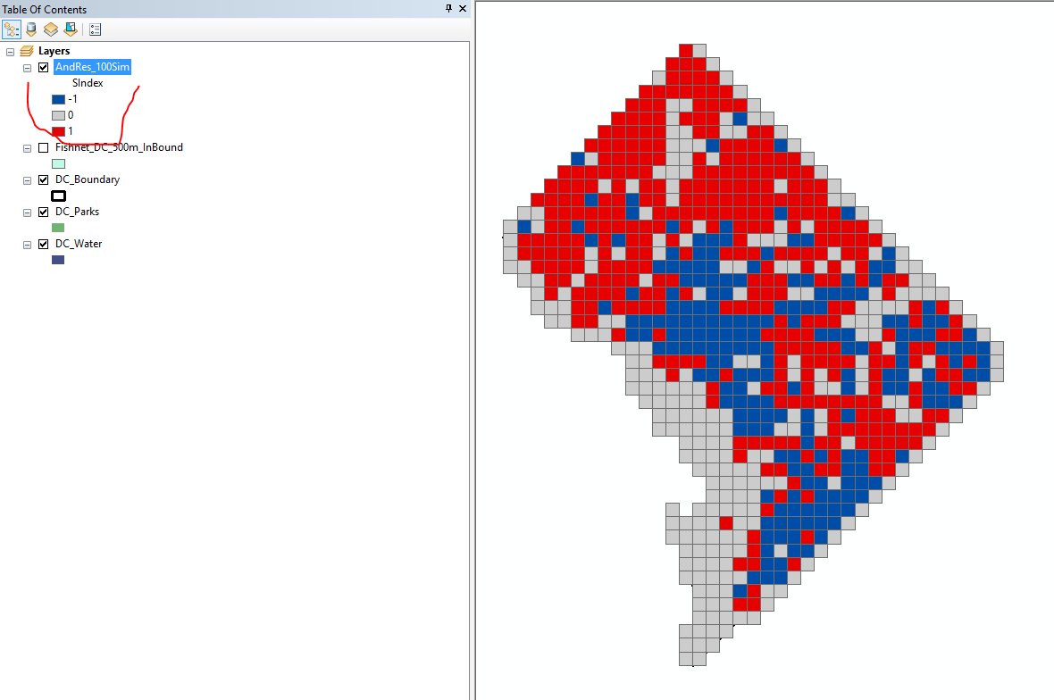
Alot of the grey areas end up being grid cells that are mostly covered by the water or parks, so subsequently have very little instances of geocoded crime or 311 calls. (That isn’t to say parks do not have crime, but the way crime is recorded there are only a limited number of locations within the parks that are associated with crime or 311 calls.)
Here I am going to show an additional analysis though, making a scatterplot with the data. This is similar to GeoDa, and is a very nice feature to use in ArcMap. Open up the attribute table, and select the list icon on the top left. In that dropdown select “Create Graph”.
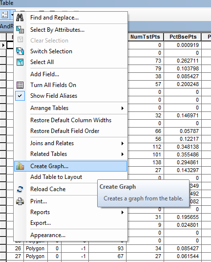
Here we are going to make several changes.
After those changes are done here is what my graph looks like.

Go ahead and click Next. We can then go ahead and clean up various parts of the graph. Here I edit the title, and the X and Y axis labels to something more meaningful. Remember the test points are crimes, and the base points are 311 calls. Same as a map, you want to make the information in the graph self-contained in case it gets reshared, so the more complete the textual information the better.

Go ahead and click finish. You will then get a graph in a new window. If it is really small you can drag the corners of the graph to resize its width and length. You can also right click on the graph and export it to an image file. Again you have similar options as to when you export the map. You can save it in either vector format (PDF, Metafile, SVG), or save it in raster (for these types of graphs you should always use PNG, do not use JPG).
But another cool option you can do is select items in either the map or the graph, and they will be highlighted in the other window. We can see here that we have one high outlier on 311 calls, but it is only in the middle range for crime. Go ahead and select that point in the scatterplot, and we can see where it is on the map.
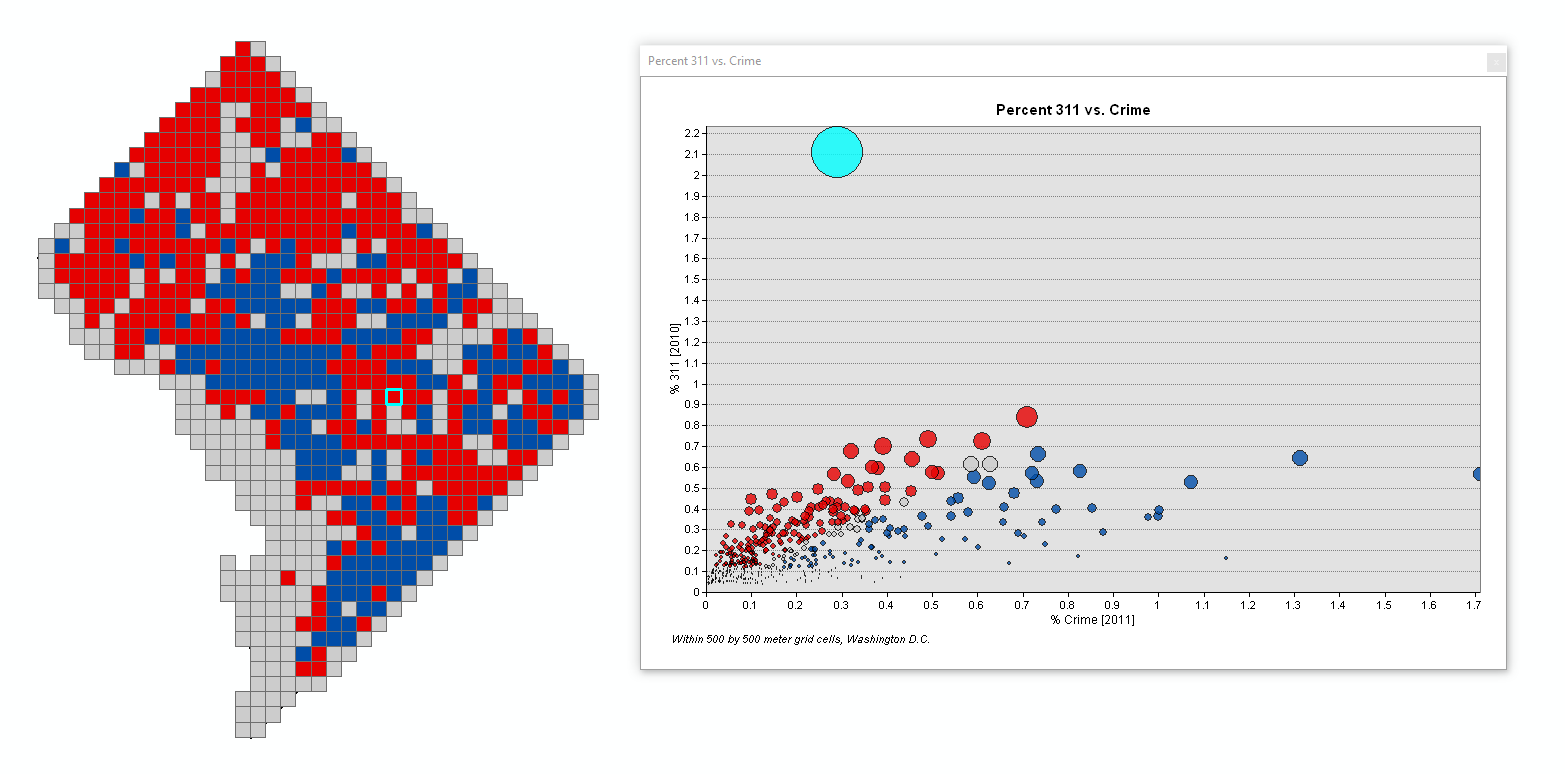
There are a few ways then to figure out what is going on in this location. You would want to inspect both the original 311 point data, and import a background map to see if there is any special location in this area. For example, if you are looking at crime, a frequent candidate for a place with many crimes is a large shopping mall or a store like Wal-Mart. Here there ends up being 2,285 311 complaints in this area. Over 1,500 of them are in one building, 100 14th St NE. Looking at the records it may be that these are accidentally duplicated data. It may also be the case though that multiple people in that apartment perpetually filed complaints every day for curb and gutter repair, tree trimming, street repairs, and abandoned vehicle lookup.
I found these out by simply selecting 311 calls in that grid cell using the select tool, and then sorted the attribute table.
Before applying this to your application though there are some things to keep in mind. One is that when you have more areas you will find more differences. Whether those differences are meaningful take a bit more inspection that just seeing if they are statistically different according to the confidence interval Andresen’s software spits out. As you can see in this example, both patterns have a high correlation with one another in this example, there is only one outlier.
Also it is the case that what is the base dataset and what is the test dataset is arbitrary. Since the confidence intervals are constructed only around the test dataset, it can make a difference which one you choose. Here if I chose the test dataset to be the 311 calls instead of crime, the simulations would have taken longer (since the 311 dataset has many more points). The confidence intervals would have been much smaller though, and subsequently made the S index lower. In some articles Andresen chooses the base set to be crime for the greater period, and the test set to be the subset. E.g. when testing if spring is different, compare it to the base for the whole year. Other times though he did all pairwise comparisons, e.g. spring vs summer, summer vs fall, spring vs fall, etc.
When interpreting Andresen’s global S index (the proportion of the areas with the same percent according to the test sample confidence interval) you need to take into account these factors. I don’t think the global measure though is that informative. I prefer to see the maps and graphs of the differences.
Several of these problems I solved in my paper A. Wheeler, Steenbeek, and Andresen (2018), but those adjustments are not available in the GUI tutorial here, and would require using R.
This is still a work in progress, I would like to provide additional tutorials as time passes, but here are some additional materials on relevant point pattern analysis with applications in criminology that might be of interest.
For your homework conduct Andresen’s spatial point pattern test again, but examine the overlap of 2017 violent crimes and pedestrian stops in New York City at the Precinct level. (The data is available in the Homework data folder.) Use violent crimes as the base dataset, and stops as the test dataset. Make a map of the precincts that are different. Also make sure to include a scatterplot of the two event patterns on the map PDF you turn in (right click on the graph and select Add to Layout to accomplish this.
For 5 points extra credit I will allow you to conduct a near-repeat analysis. But it needs to be a new dataset that you find yourself (e.g. thefts from motor vehicles in Dallas). Write up the results into a nice table or graph and provide a written interpretation, don’t just turn in the HTML output. An additional 5 points if you not only conduct the near-repeat analysis, but also map the near-repeat strings. See the newer near-repeat software mentioned at the beginning, and also footnote 2 about identifying those near-repeat strings. (ArcGIS also has a tool to do this as well, but you need to import the space-time distance band that you want to use it, hence the need for Jerry’s calculator.)
Andresen, Martin A, and Shannon J Linning. 2012. “The (in) Appropriateness of Aggregating Across Crime Types.” Applied Geography 35 (1): 275–82.
Andresen, Martin A, and Nicolas Malleson. 2014. “Police Foot Patrol and Crime Displacement: A Local Analysis.” Journal of Contemporary Criminal Justice 30 (2): 186–99.
Andresen, Martin A, Shannon J Linning, and Nick Malleson. 2017. “Crime at Places and Spatial Concentrations: Exploring the Spatial Stability of Property Crime in Vancouver Bc, 2003–2013.” Journal of Quantitative Criminology 33 (2): 255–75.
Linning, Shannon J. 2015. “Crime Seasonality and the Micro-Spatial Patterns of Property Crime in Vancouver, Bc and Ottawa, on.” Journal of Criminal Justice 43 (6): 544–55.
Loeffler, Charles, and Seth Flaxman. 2016. “Is Gun Violence Contagious?” ArXiv Preprint ArXiv:1611.06713.
Ratcliffe, Jerry H., and George F. Rengert. 2008. “Near-Repeat Patterns in Philadelphia Shootings.” Security Journal 21 (1-2): 58–76.
Wheeler, Andrew P. 2018. “The Effect of 311 Calls for Service on Crime in d.C. at Microplaces.” Crime & Delinquency 64 (14): 1882–1903.
Wheeler, Andrew P., Robert E. Worden, and Sarah J. McLean. 2016. “Replicating Group-Based Trajectory Models of Crime at Micro-Places in Albany, NY.” Journal of Quantitative Criminology, 32 (4): 589–612.
Wheeler, Andrew, Jasmine Silver, Robert Worden, and Sarah McLean. 2018. “Mapping Attitudes Towards the Police at Micro Places.” Social Science Research Network, Https://Papers.ssrn.com/Sol3/Papers.cfm?abstract_id=3079674.
Wheeler, Andrew, Wouter Steenbeek, and Martin A Andresen. 2018. “Testing for Similarity in Area-Based Spatial Patterns: Alternative Methods to Andresen’s Spatial Point Pattern Test.” Transactions in GIS 22 (3): 760–74.
Wu, Xiaoyun, and Cynthia Lum. 2016. “Measuring the Spatial and Temporal Patterns of Police Proactivity.” Journal of Quantitative Criminology, 1–20.
Xu, Jie, and Elizabeth Griffiths. 2016. “Shooting on the Street: Measuing the Spatial Influence of Physical Features on Gun Violence in a Bounded Street Network.” Journal of Quantitative Criminology, 33 (2): 237–53.
Zeoli, April M., Jesenia M. Pizzaro, Sue C. Grady, and Christopher Melde. 2012. “Homicide as Infectious Disease: Using Public Health Methods to Investigate the Diffusion of Homicide.” Justice Quarterly 31 (3): 609–32.
Another coordinate reference system to define latitude and longitude you might encounter is NAD 1983. If you import your points and they are shifted by around 10~20 meters from where they should be, that would a potential explanation.↩
The near-repeat calculator also allows you to export strings of near-repeat incidents to further map them. I have provided code in R and Python to accomplish the same feat - identifying the near-repeat strings of events. The Groff/Taniguchi calculator also provides this functionality.↩