For a reminder, the readings for this week are:
For this week we will be going over some criminological theory that is relevant to point pattern analysis - in particular theory that explains why crime clusters at certain places. Then we will go over some cartographic advice about presenting point pattern maps. Then we will go over some of the nuts and bolts of making hot spot maps.
What makes mapping crime so useful is the fact that it clusters - certain areas in a city are more likely to have a crime occur in them. This makes targeting crime at these hot spots just a commonsense strategy. For example, there is no point in trying to reduce shootings in places that shootings are rare, but if there is a street corner or a small area where they are prevalent you will likely want to come up with some local intervention.
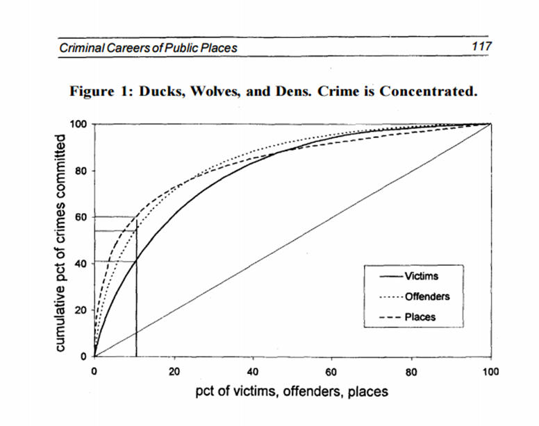
This is called the law of crime concentration (Weisburd 2015), but this same clustering also occurs for victims and offenders (and many different datasets in the natural and social sciences). The below chart shows the cumulative distribution of crimes among places, victims, and offenders (Spelman 1995). The way to read the chart is, for the places dashed line, 10% of the places in that sample contain 60% of the crime. This same general pattern holds for people as well, very few people account for most victimizations and most offenses.
So why does crime cluster? Potential explanations can occur at the neighborhood level, such as areas with higher levels of poverty have more crime. But even in neighborhoods with high crime, there are street that have very little crime and some streets that are high crime (Weisburd et al. 2004). These differences are not random either, they persist over a very long period of time. Here is a graph from some of my work in Albany, looking at crime trajectories from 2000 through 2013 at street midpoints and intersections (Wheeler, Worden, and McLean 2016).
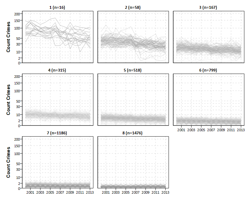
Overall crime has declined in Albany over the time period (as well as the entire US), but what this shows is that high crime places in 2000 also tended to be high crime in 2013. You could essentially make a hot spot map in 2000 and it would like very similar to a hot spot map now in Albany! But what this also means is that whatever causes crime at places to be high also has to be temporally consistent over that same time period.
Also note that this relationship not only holds for places, but amongst types of places as well. Eck, Clarke, and Guerette (2007) describes how when examining different institutions (such as apartment complexes or bars) there tend to be a few that disproportionately contribute to crime.
Crime pattern theory was introduced in the readings for your homework, and is what I think the most simple way to guess if a place is going to be high crime when examining small geographic units of analysis (like specific streets or addresses). In the Brantingham’s typology, high crime places can either be crime generators, or they can be crime attractors.
Crime generators are places where there is simply more people interacting and walking around. Often an address that has the most reported crimes in a city is a shopping mall (or large grocery stores). These aren’t typically considered dangerous or more criminogenic though, but are places that have many people interacting. All those potential interactions result in more crime occurring. Others who have done historical work in Seattle (Schmid 1926) and Chicago (Clifford R. Shaw and McKay 1969) show hot spots of crime 80 to 100 years ago that also correlate very highly with current crime patterns in those cities, and those hotspots happen to be in the central business districts for those cities. For the obverse situation, think of an abandoned factory or the middle of a lake. Neither place has many people at any time, thus there is very little crime potential at either location.
Crime attractors are places that actually attract motivated offenders due to having easy targets available to victimize. So these are places that are more traditionally considered criminogenic or subjectively dangerous places. A favorite example is bars (like a dive bar that attracts a real rough crowd), but others also include red-light districts, as people conducting illegal business are easier to rob and less likely to report their victimization to the police (Bernasco and Block 2010).
In practice it is really hard to empirically distinguish between crime generators and crime attractors. A bar can both have more people in a small space compared to the surrounding area, and can potentially attract deviant individuals. So many places may be considered both.
Another important concept in crime pattern theory are paths that connect those crime attractors and crime generators. (The Brantingham’s often refer to crime generators and attractors as nodes in a network, paths are the ways to travel in-between those nodes.) Crime does not solely happen within those places that are crime generators (or attractors), but diffuses out into the environment (Bowers 2014; Groff 2014). Lemieux and Felson (2012) using national estimates of victimization and time-use surveys estimates that the risk of being victimized (per person and unit time) is much higher when traveling in-between places. My work estimates that the spatial diffusion effects of alcohol outlets is actually larger than the increase at the actual bar (Wheeler 2018a).
Another theory of why particular places tend to be high crime is that different spaces influence individuals behavior in different ways. Things that are acceptable behavior in a bar full of college students such as being loud, swearing, and excessive drinking, would not be acceptable behavior in a children’s park. These are sometimes called different behavior spaces (Taylor 2015).
The idea of behavior spaces is often not a central theory by itself, but is often discussed in relation to different theories of crime. One example is in Newman (1972) theory of defensible space, Newman discusses how different shared corridors for public housing can influence collective behavior. In the case of the long corridors in high rise buildings, individuals did not take initiative to clean the hallway or decorate the outside of their doors. For the buildings that were smaller spaces though (like a house split up into four apartments), tended to be better maintained by the residents. Newman attributed this to the fact that the neighbors in the long high rises were much less likely to know one another.
Another example is in broken windows theory (Wilson and Kelling 1982). The theory is that physical cues, such as a broken window or someone panhandling on the street, signal to individuals that no one cares and is taking care of that space, so it is OK to be deviant. One of my favorite tests of this was an experiment that primed particular locations with bad behavior, and then showed it promoted that same bad behavior (Keizer, Lindenberg, and Steg 2013). One of their experiments showed that if they left a shopping cart in the middle of the grocery store parking lot without returning it, more people would do the same throughout the day.
It is difficult in practice to delineate the boundaries of behavior spaces. There is ultimately no perfect spatial unit of analysis to conduct crime at (unfortunately). Next week I will talk some more about choosing a spatial unit of analysis for different types of analyses. This week though I will focus on spatial analysis of one crime at a time, in which case you do not need to make that decision.
The first thing I am going to go over in terms of making maps of point patterns are gestalt principles of perception. These are basically ways our mind immediately recognizes the images we see, and this can help us make better maps.
First, try to identify all of the 9’s in the below image.
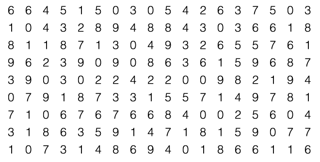
Pretty hard and kind of annoying. Now how about trying to identify them in this image.
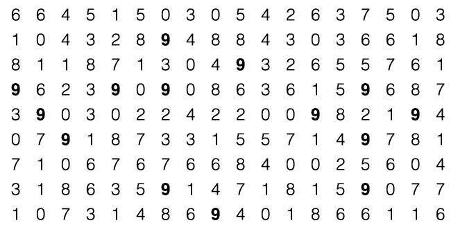
Much easier – all by a simple change in making the 9’s bold. What this does is effectively bring them to the foreground of the plot, and make them the first thing we notice.1 I could also make them immediately recognizable by making them larger or a different color.
Another gestalt principle is proximity, we recognize objects that are closer to one another and group them together.
----
----
----
----
So in the above example, do you see four rows of dashes, or four columns? Four rows right - that is because of the spacing between rows we. How about below?
1   5   16
2   6    9
3   7   12
We can easily see the columns of numbers. When learning addition and subtraction we actually line up numbers this way, because it is easier to look for patterns among numbers in columns than across rows (Feinberg and Wainer 2011).
In this example from Treisman (1985), she shows how alignment among points and color is generally a higher up classifier than are shapes.
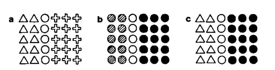
So in this example, people more readily distinguish between white and black than they do between white triangles and white circles. The implications of this for point maps, in which the points are not readily aligned, is that they can become very difficult to detect clusters, especially when you have too many different types of colors and symbols.

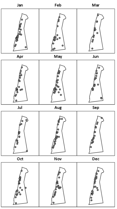
This example is basically impossible to tell if there are any temporal patterns by month, nor can you easily tell the overall prevalence of robberies by month. A much simpler presentation is to make many smaller maps and align them.
While it is popular to make crime maps with many symbols that closely mimic the crime (like an outline for a homicide, or a gun for a weapon offense), these symbols often impede ones ability to easily spot patterns in the maps and become distracting. So don’t use them in maps for my class!
I also need to go over how to make some pretty hot spot maps for showing point patterns, because they can be complicated. Here is an example from the online crime map for Troy, NY, all of the aggravated assaults within the last year.
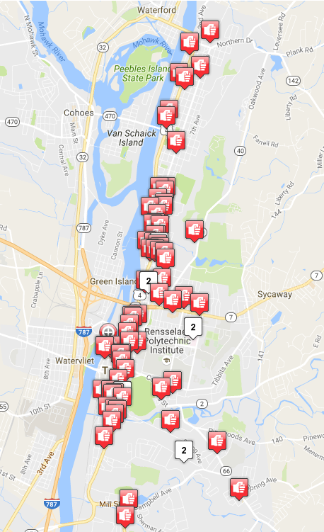
You may think from that crime is rampant and occurs everywhere! But there are definitely hot spots of crime within that map. You need to reduce the data in meaningful ways though to uncover those patterns. The readings in the CrimeStat manual were all about useful ways to reduce that data to uncover meaningful patterns.
In statistics, you learn about the central tendency of a set of numbers, such as the mean, median, and mode. Centrographic statistics are simply an extension of these measures to geographic data that has both an X and Y coordinate. The simplest of these is the centrographic mean. If you have a set of X and Y coordinates for map points, the centrographic mean is simply the average of the X values and the average of the Y values. So this basically turns a complicated hot spot of many points into one point. There are similar metrics for variance and spread as well as central tendency in 2d space.
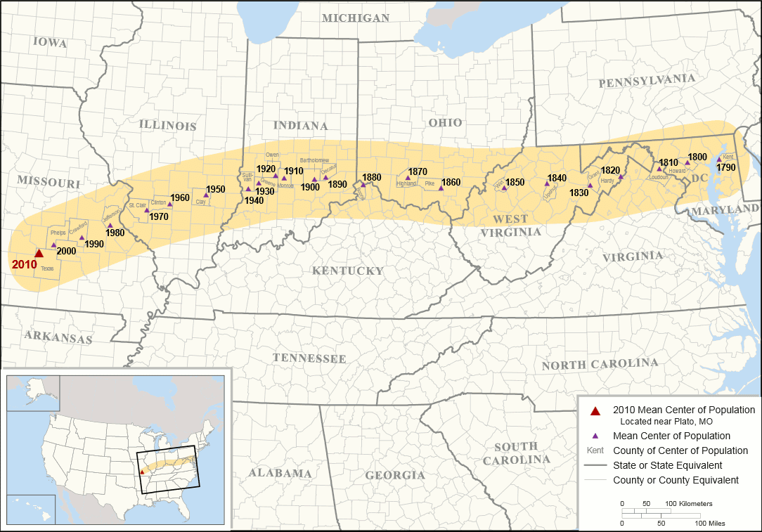
My favorite example of this is mean center of population for the United States over time
The only example I am aware of using this in crime mapping is in Frazier, Bagchi-Sen, and Knight (2013). In that application they examine demolitions in Buffalo, and show that the centroid of different crime points change over time. But I imagine looking at crime data over along period of time someone could come up with a useful example. (Such as a city that is expanding, and see the variance of crime expanding over along period of time.)
Another way to reduce the complexity in a crime map with many points is to cluster them. Popular clustering tools are k-means clustering, scan statistics, or hierarchical clustering. The CrimeStat manual has examples of these. I am not going to go over them much more, as I prefer kernel density maps. People sometimes pretend as the clusters produced are real things, but they are just abstractions from the computer. (In the extra point pattern tutorials I have an example of creating actual hot spot polygons using Richard Block’s STAC statistic, available in CrimeStat.)
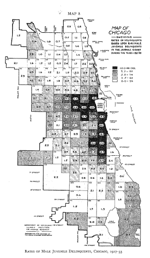
Quadrat analysis is the process of taking a point pattern and then summarizing it into arbitrary areas, often a regular grid over the study area. The most famous application of using this in criminology is Shaw and McKay’s work. This is image is taken from their 1969 edition (Clifford R Shaw and McKay 1969).2
Often times it is easier to summarize patterns like this if you make arbitrary areas, especially between two different point patterns. Sometimes you cannot use other established areas, like census blocks, because the crime incidents fall on the border. This may happen if you are mapping things that are frequently recorded at intersections, like traffic stops/accidents, or if the data you are using is truncated to the 100 block (Stucky and Ottensmann 2009). (Truncating to the 100 block is a common way that police departments publicly release crime data, but it slightly preserves the anonymity of victims.)
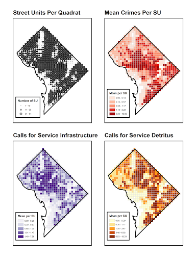
Here is an example map from my work showing how making a regular grid can be used to vizualize several different point patterns (Wheeler 2018b).
Next week I will go into more examples of how quadrat analysis can be used. But for now there are several limitations to this though. The grid itself is arbitrary in size, should you use cells of 1 mile (like Shaw and McKay), or smaller areas like I or did or the Stucky article I cited. One way around this for visualization purposes is to construct kernel density maps, which produce a smoother grid at smaller areas.
Kernel density maps I believe are the most useful way to identify hot spots of crime. They take many different points and make them into a smooth surface. So if we have our complicated map with many points, imagine that each point is a lump of playdough. For each point you smooth it out into alittle hill shape. Points nearby each other the edges of the hills will overlap, so will stack on top of each other. Then for your map you color places with thicker playdough a darker color, and those are your hot spots.
Here is a diagram of the (from the CrimeStat manual). So the red dots at the bottom are the original points, the red dashed lines would be the playdough for an individual point, and the blue line is the stacked playdough.
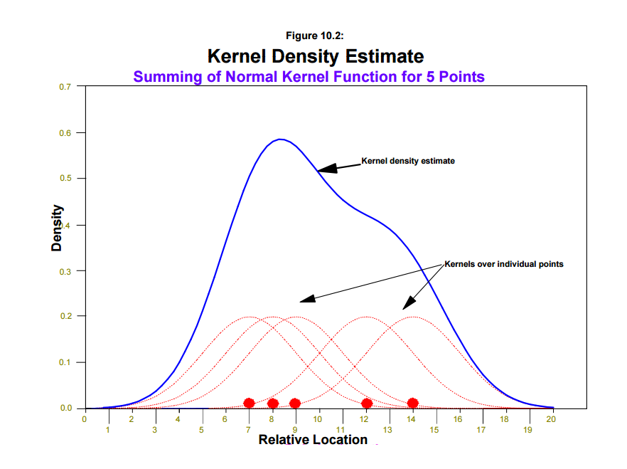
With this we then have two choices to make, how far out we spread the playdough, and what shape our hill will take. In statistics jargon, how far out to spread the playdough is the bandwidth, and the shape of the hill is the kernel. In this example the hill is shaped like a normal curve, but you could use shapes like a triangle, or have the hill more peaked. The shape actually does not tend to make much of a difference, but the bandwidth does. Typically I use 300 to 500 meters as my default bandwidth for crime data in one city, but if your map comes out with many small hot spots, you may consider making the bandwidth larger. If your map comes out with just one very large hot spot, you want to make the bandwidth smaller.
This then produces a smooth map in two dimensions that you visualize in color. Here is that aggravated assaults map as a kernel density map.

(Note that are a few things I don’t like about how the online LexisNexus map does this, it has no legend, and the colors are not colorblind safe, but hopefully you understand the idea.) This shows two hot spots, one is above route 7, and one is below. Areas to the far north and south have a lower prevalence of aggravated assaults.
Now the density (the number on the Y axis in the CrimeStat chart), is sometimes hard to interpret. So I am going to walkthrough a simplified example.
Imagine that we just estimated our kernel density. The visualization the computer spits out in one dimension can be envisioned as:
    +
    +
  + + +
+ + + + +
1 2 3 4 5
Here the total number of +’s is 10. Pretend that 10 is the total number of crimes also inputted into the procedure.
We could simply represent the height as is:
Height:   1   2   4   2   1
Location: 1   2   3   4   5
The sum over all bins equals the total number of +’s to begin with, 10. This in CrimeStat is listed as the absolute density. If you take the sum of the absolute density over the entire grid, it equals the total number of crimes you input into the procedure.
Height also could be represented as a probability per bin. You would simply divide the first set of answers by 10, so we have:
0.1 0.2 0.4 0.2 0.1
 1   2   3   4   5
Note the sum of all bins equals 1. This in CrimeStat is listed as probabilities.
We also have a spatial dimension as well. Pretend this is a 2d map, and that the area of each bin is 100 square meters (so each side is 10 meters). We could then divide each estimate instead of by the total number of crimes but by the area - this would then be a density per 100 meters square.
0.01 0.02 0.04 0.02 0.01
 1    2    3    4    5
This sums to 0.1, which would be the total number of observations, 10, divided by the area of a single bin, 100.
So here we would write the density for the first bin as 0.1 per 100 square meters. You may want to change this though to another spatial metric, say per square meter or per square kilometer. This is useful if you have very small or big numbers, but is alittle tricky to interpret. So to go down to 1 square meter is simple, if we have 0.1 per 100 square meters, i.e.
    0.1
    ---
100 Square Meters
To change this to 1 square meter we simply divide by 100 - i.e. reduce the fraction.
    0.001
    -----
1 Square Meter
Now we can change to a different metric, say per square kilometer. A square kilometer is simply 1000*1000=1 million square meters. So we multiply our fraction by 1 million:
    1000                           1000
   ------                =        ------
1,000,000 Square Meters        1 square kilometer
Note that you cannot interpret any one cell now as having 1,000 crimes per kilometer (it is an extrapolation if any one cell were expanded to be one square kilometer).
All of these different metrics; absolute, probabilities, and density per area, are linear transformations of one another. What that means is that the shape of the surface is always the same, it is just the relative scaling that differs between these different units. Density per area is the easiest to compare to other maps if they use a different grid cell size, but if you use the same grid cell size it is easier to make comparisons as long as you use the same metric between maps.
If you want to compare densities for different crimes, you need to take into account the relative numbers. For example, if you have 100 robberies, and 200 aggravated assaults, you might want to compare probabilities (as the absolute assault density is likely to be higher than robbery density everywhere). If you want to compare 2011 robberies to 2012 robberies though, using absolute density is just fine.
For your homework, I will have you make a map of repeat-address locations and estimate a smooth kernel density map. For next week you will not have any additional reading, but will have an exam.
Bernasco, Wim, and Richard L. Block. 2010. “Robberies in Chicago: A Block-Level Analysis of the Influence of Crime Generators, Crime Attractors, and Offender Anchor Points.” Journal of Research in Crime and Delinquency 48 (1): 33–57.
Bowers, Kate. 2014. “Risky Facilities: Crime Radiators or Crime Absorbers? A Comparison of Internal and External Levels of Theft.” Journal of Quantitative Criminology 30 (3). Springer: 389–414.
Eck, John E, Ronald V Clarke, and Rob T Guerette. 2007. “Risky Facilities: Crime Concentration in Homogeneous Sets of Establishments and Facilities.” Crime Prevention Studies 21: 225.
Feinberg, Richard A., and Howard Wainer. 2011. “Extracting Sunbeams from Cucumbers.” Journal of Computational and Graphical Statistics 20 (4): 793–810.
Frazier, Amy E, Sharmistha Bagchi-Sen, and Jason Knight. 2013. “The Spatio-Temporal Impacts of Demolition Land Use Policy and Crime in a Shrinking City.” Applied Geography 41: 55–64.
Groff, Elizabeth R. 2014. “Quantifying the Exposure of Street Segments to Drinking Places Nearby.” Journal of Quantitative Criminology 30 (3): 527–48.
Keizer, Kees, Siegwart Lindenberg, and Linda Steg. 2013. “The Importance of Demonstratively Restoring Order.” PloS One 8 (6). Public Library of Science: e65137.
Lemieux, Andrew M, and Marcus Felson. 2012. “Risk of Violent Crime Victimization During Major Daily Activities.” Violence and Victims 27 (5): 635–55.
Newman, Oscar. 1972. Defensible Space. Macmillan New York.
Schmid, Calvin F. 1926. “A Study of Homicides in Seattle, 1914 to 1924.” Social Forces 4 (4): 745–56.
Shaw, Clifford R, and Henry D McKay. 1969. “Juvenile Delinquency and Urban Areas.” University of Chicago Press.
Shaw, Clifford R., and Henry D. McKay. 1969. Juvenile Delinquency and Urban Areas: A Study of Rates of Delinquency in Relation to Differential Characteristics of Local Communities in American Cities. Revised Edition. Chicago, IL: University of Chicago Press.
Spelman, William. 1995. “Criminal Careers of Public Places.” Crime Prevention Studies 4: 115–43.
Stucky, Thomas D, and John R Ottensmann. 2009. “Land Use and Violent Crime.” Criminology 47 (4). Wiley Online Library: 1223–64.
Taylor, Ralph B. 2015. Community Criminology: Fundamentals of Spatial and Temporal Scaling, Ecological Indicators, and Selectivity Bias. NYU Press.
Treisman, Anne. 1985. “Preattentive Processing in Vision.” Computer Vision, Graphics and Image Processing 31 (2): 156–77.
Weisburd, David. 2015. “The Law of Crime Concentration and the Criminology of Place.” Criminology 53 (2): 133–57.
Weisburd, David, Shawn D. Bushway, Cynthia Lum, and SueMing Yang. 2004. “Trajectories of Crime at Places: A Longitudinal Study of Street Segments in the City of Seattle.” Criminology 42 (2): 283–322.
Wheeler, Andrew P. 2018a. “Quantifying the Local and Spatial Effects of Alcohol Outlets on Crime.” Crime & Delinquency Online First: https://doi.org/10.1177/0011128718806692.
———. 2018b. “The Effect of 311 Calls for Service on Crime in d.C. at Microplaces.” Crime & Delinquency 64 (14): 1882–1903.
Wheeler, Andrew P., Robert E. Worden, and Sarah J. McLean. 2016. “Replicating Group-Based Trajectory Models of Crime at Micro-Places in Albany, NY.” Journal of Quantitative Criminology, 32 (4): 589–612.
Wilson, James Q, and George L Kelling. 1982. “Broken Windows.” Atlantic Monthly 249 (3): 29–38.
This image and example is taken from Robert Kosara’s blog.↩
For some other examples of historical maps and graphs in criminology, see my blog post, Favority maps and graphs in historical criminology. I give a few more examples from Shaw and McKay, as well as from other criminological work.↩