
Welcome to the class! Again, for reminder, these lesson notes will take the place of traditional lectures.
This week we are introducing some basic parts of mapping. If you took a course on mapping in a geography department you might spend many lessons on some of these topics (in particular projections). Being a graduate level course focused on spatial analysis you get more of a whirlwind tour of the topics. These topics are the minimal amount of basic GIS know-how to competently conduct spatial analysis in the social sciences.
For a reminder, the expected readings for the week are:
See the syllabus for the weekly readings. We shall subsequently explore the types of geographic data, projections, and geocoding for the topics this week.
There are two basic types of geographic data; vector and raster.
Vector data are points, lines, and polygons. Vector data are only defined by a series of coordinates. For example, a triangle is defined by three coordinates.
The notation (0,0) refers to the x and y coordinates of the triangle (which is a Cartesian coordinate system).1
A point is vector data that has only one coordinate (i.e. one (x,y) pair). Lines have a minimum of two coordinates, and polygons have a minimum of three coordinates. Lines have length but no area, polygons have area, and points have neither. Polygons may have length (depending on how you define it). For example you can turn the outside of a polygon into a line and measure how long that line is.
Here is an example map that only uses vector data. It has examples of lines (the border of DC) and polygons (rivers and parks). You cannot technically see a point in a map, you have to give it some area, such as drawing it as a small circle, to actually visualize it. So although the underlying data for the grey circles is just one point in space, they are visualized as varying sized circles. Ditto for lines, in that you have to give it some area to be able to visualize it.

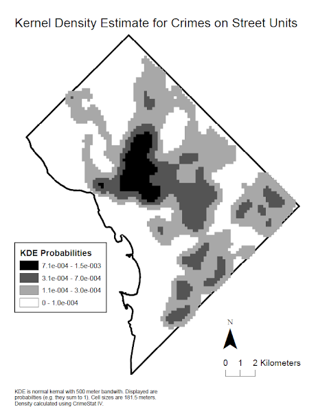
The second type of geographic data is raster. Raster data is defined by a regular grid of pixels. Here is an example raster map, a kernel density estimate, (again of DC) and taken from my dissertation.
Anytime you take a picture with a camera the underlying data is in raster format. The picture appears smooth though, because the pixels are tiny. A characteristic of raster data is that if you zoom in too small, you can see the individual pixels and the image does not look as nice. This is not the case with vector data though, you can continually zoom in and the polygons will still be sharp. Aerial imagery is likely the most common type of GIS raster data, but another common type is digital elevation model (DEM) data. This data is simply a grid of the height of the ground - useful for things like telling the slope of a hill (necessary to know where to build roads and houses) or telling where places are most likely to flood.
Go ahead and zoom into the DC Vector image, which is saved as a SVG file. The triangle image is saved as a PNG file though. That is, even though it depicts vector data, the actual image in the document is a raster format. So if you zoom in far enough you can see the pixels.
For social sciences, we tend to deal much more often with vector data than raster data. There are a few exceptions we will see for this course (such as kernel density maps). Many types of geographic operations are only applicable to either vector or raster data, but not both. For example, you can add raster datasets together, but adding vector spatial data is not well defined. You can buffer vector data, but it does not make sense to buffer a raster dataset.
Pro-tip: When saving images (both in this class and for statistical graphics) save them as high-resolution PNG images. Saving files as actual vector graphics (such as SVG or PDF) can sometimes make the files very big. For my example DC vector map, it has at a minimum of over 10,000 xy coordinates for the points, and many more coordinates for all of the vertices for the river, park, and DC border. If you save as a PNG image it turns the image into a raster, but it is much smaller in size, and tends to look quite nice unless you zoom in very far. A common default to save images though is JPEG, which compresses the image, and tends to make vector images look bad (although is good for camera images or aerial images).
The earth is an approximate sphere. Maps (with the exception of an actual globe) are typically only drawn in two dimensions. The process of taking the three dimensions and turning it into two dimensions is called projecting the data.
Projections by necessity have to cause some distortion. Imagine taking an orange peel and laying it flat on a table. To do so you will need to stretch and tear the orange peel at some points.
The types of distortion are typically categorized into three types:
Projections typically try to preserve two of these aspects as best they can, but in the process tend to greatly distort the third.
The most common world projection is the Mercator projection (image taken from Wikipedia):

The Mercator projection preserves the shape of land-masses quite well. It was originally popular in the 1600’s because of the fact when travelling east-west across the Atlantic ocean it is very close to the shortest line between two places. It is popular now because most online web mapping platforms use it, and I suspect it was popular before then in grade school books because of the fact it preserves the shapes of land masses well.
The Mercator map though does not preserve areas. Land-masses closer to the poles appear larger in the map than they are in actuality. The most notable example is Greenland is shown to be massive – here is an example of Greenland on the map vs. its actual size compared to Africa:

(This was taken from a game that google maps had online where you dragged the countries to the correct location, but unfortunately it is not online anymore.)
Here is an example worldwide projection that preserves areas, a Mollweide equal area map:

My favorite example of a map projection snafu (related to the problem of the Mercator projection), comes via the Economist, in which they published a map of the missile range of North Korea (images via Ken Fields blog):
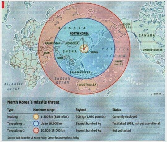
This buffer however, is simply wrong. Here is what the correct distance buffers should look like:

This error was due to confusing the two dimensional Mercator map with the actual world. While the buffers may have been correct in that particular coordinate system, they were not correct when taking into account that the coordinate system is not a 100% accurate reference of the world.
There are many types of map projections, but for the most part they aren’t as relevant to crime analysis. This is mainly because we rarely use data over a large geographic area. When zooming into smaller areas, distortions due to different projections become much less notable. The buffer problem is much less notable when zooming into say a state or a city.
Also we are almost always using projections created by others – I’ve never come across a situation where I needed to make my own customized projection. There are standard projections in use for certain areas of the world that you will use in the majority of circumstances.
To understand mapping you need some basic knowledge of what a projection is (i.e. where do those x and y coordinates come from), and you should be aware that projections always cause some distortion.
The distortion is one of the (many) arbitrary decisions you need to make when you are making maps. For example, the Mercator map is torn most often in the Pacific Ocean (the opposite of the Prime Meridian running north-south through England). But this is arbitrary, one could tear the map in the middle of the Atlantic Ocean, or tip the map sideways and tear it at the Equator.
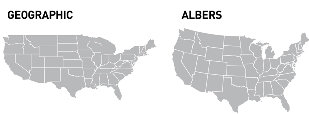
Pro-tip: If mapping the entire US, use Albers Equal Area Conic Projection (image via here):
Here is the only example I have seen of using a custom projection within criminology – a NY Times article on gun trafficking:

The only thing unique about it is turning the map sideways!
Geocoding is the process of taking a textual address and assigning it geographic coordinates. Those coordinates can be a point in space, a line, or a polygon. Common examples are if you have a spreadsheet of addresses (e.g. “77 Western Ave, Albany, NY”), or zip-codes (e.g. “12203”).
Geocoding textual addresses is a common procedure for crime analysts. Many police departments still record crime incidents in paper forms, and the analyst needs to take these addresses and assign them x,y coordinates to be able to map them.
There are two common ways to do this. One is geocoding using street-centerlines, and the other is geocoding using parcel data.
Street-centerline geocoding can be described like this. You have a set of streets, and these streets segments are indexed such as “Main Street Left 101-199” and “Main Street Right 100-198”. Below is an example depiction of one segment in a street centerline file.

If you have then have an address such as “150 Main St.”, you then know that it is on the right side of the street, about in the middle. Whereas “197 Main St.” you know is on the left side of the street close to the end.
Street centerline geocoding tends to work well in urban areas, but the interpolation can be very poor in rural areas.
The other common way of geocoding addresses is using a parcel dataset. Parcels are polygons, most often defined by cities for tax purposes. You may then just assign “150 Main St.” to wherever the parcel is for that address.
Geocoding police records may use both types, but street centerline geocoding is likely more common. You often need the street centerline files to geocode many events, as many events are recorded at intersections of streets. In particular traffic stops and crimes occurring outdoors are frequently just given an address of the nearest intersection. Also parcel datasets can often miss many addresses, as a series of addresses (such as in a strip mall) may belong to the same landowner (so only have one parcel for tax purposes) but have different addresses.
Online services (such as if you type an address into google) tend to use a mixture of these services. If they know a parcel exists, they will frequently place the coordinate on the rooftop of the building within the parcel. If they cannot find that exact address though, they will often interpolate along the street using the street-centerline file.
Even when matching to an area (such as a parcel), it is common for whatever geocoding program you are using to only return a point (i.e. one pair of x,y coordinates). For parcels this may be the centroid (or the roof as previously mentioned). For larger areas such as zip-codes or cities this may simply be the centroid (i.e. the center point) of the larger polygon or line.2
Zip-codes are another common form to have data collected for (surveys often can only be identified or sampled by their zip code), so they deserve special attention. Zip-codes are defined by the US Postal service for defining mailing routes. Zip-codes technically do not have areas, but people have made areas based on those routes, such as the US Census.
For example here is a map of the zip-code tabulation areas from the Census that intersect Albany, NY (I made this map):
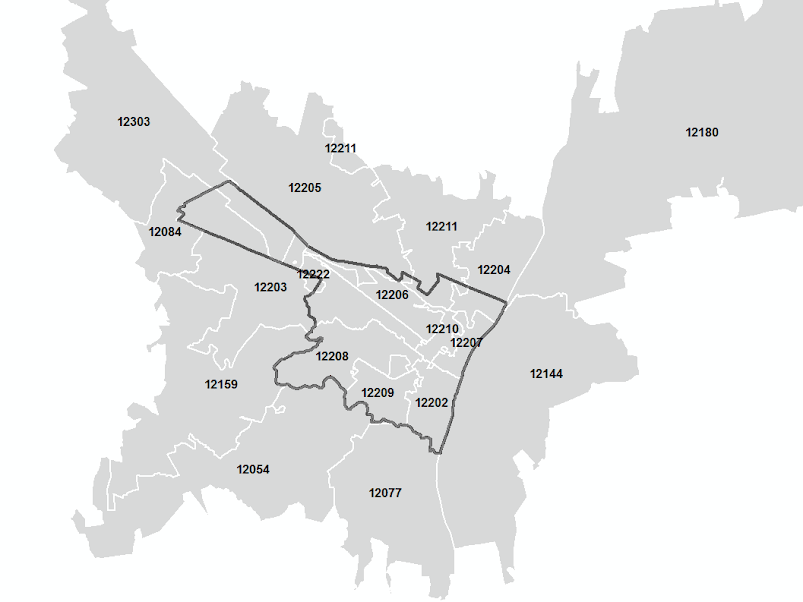
Note that zip-codes do not conform to the boundary of Albany. This can be a problem when conducting surveys at the zip-code level.
Also another idiosyncrasy of zip-codes is the fact that they are not necessarily contiguous areas. This is not visible in the map, but one example is that the SUNY-Albany campus gets its own zip code, 12222. In this map it is centered on the main campus, but the downtown campus is also in the 12222 zip code. This is simply a limitation of people trying to make zip code areas.
You can see the actual routes that zip codes take by using this USPS tool. Go ahead and check out the postal routes for your zip-code!
I hope you are! One of the biggest mistakes students make are not reading the materials I disseminate. (And it is dreadfully easy for me to tell if you haven’t read the materials when you ask me a question about something I already addressed.) Pro-tip - if you need to triage things on your to-do list, things I write should be made higher priority than the other materials.
For this weeks readings, the Harries chapter covers some of the same material that I cover in my notes, but also has some more historical overview of making maps (cartography) as well as goes over some history of crime mapping. I have you read the Boba-Santos chapter as she has discussion about the crime analysis field. I’ve worked as a crime analyst, and her observations match my experiences. So it is good vocational advice if you are interested in pursuing crime analysis as a career.
Now that you have read the lecture notes, you should proceed to doing this weeks tutorial. This involves making a basic map of Albany - intended to help you get your feet wet in using ArcGIS and making maps. Once this tutorial is finished you should turn in your final map (a PDF document) to me via blackboard. (You will need to consult the syllabus for when materials are due.)
Also the readings for the next lesson are:
Good luck with the tutorial!
Block, Richard L., and Carolyn R. Block. 1995. “Space, Place, and Crime: Hot Spot Areas and Hot Places of Liquor-Related Crime.” Crime Prevention Studies 4: 145–84.
Levine, Ned, and Karl E Kim. 1998. “The Location of Motor Vehicle Crashes in Honolulu: A Methodology for Geocoding Intersections.” Computers, Environment and Urban Systems 22 (6). Elsevier: 557–76.
Ratcliffe, Jerry H. 2001. “On the Accuracy of Tiger-Type Geocoded Address Data in Relation to Cadastral and Census Areal Units.” International Journal of Geographical Information Science 15 (5): 473–85.
———. 2004. “Geocoding Crime and a First Estimate of a Minimum Acceptable Hit Rate.” International Journal of Geographical Information Science 18 (1): 61–72.
Another type of coordinate system (a way to write down numbers to recognize where things are), is a spherical coordinate system. This records data in terms of angle and distance from a central point. We mostly just deal with Cartesian coordinate systems though, and you can always convert numbers between the two.↩
Two great references on geocoding for criminology researchers are two articles by Jerry Ratcliffe (Ratcliffe 2001; Ratcliffe 2004). The 2004 article gives an often used reference that police crime data should at a minimum have an 85% geocoding hit rate, although most systems now have much higher geocoding hit rates, typically 95% or higher. The 2001 article describes the differences between parcel data geocoding and street centerline geocoding. Another good reference which describes common problems with geocoding police data is given in R. L. Block and Block (1995), and Levine and Kim (1998) describes how traffic accidents are frequently recorded at intersections.↩