This week we will be using Excel to create an individual officer level dashboard. I use post-contact surveys from Lincoln, Nebraska PD for the assignment. For the assignment I edited the data to create an officer ID, plus did a few other things to make the responses more interesting.
You can download the data to follow along either from ELearning, or from this Dropbox link.
One aspect that I commonly encountered was looking at rates with varying denominators. Imagine a situation in which you are looking at the proportion of arrests for an officer that have a “resisting arrest” charge. This is often used as a bad signal. If it occurs at a much higher rate for an officer than compared to their colleagues, e.g. one officer has a 50% resisting arrest rate, versus most others have only a 10%, it may be they are not doing a good job of de-escalation (or they are adding in superfluous charges).
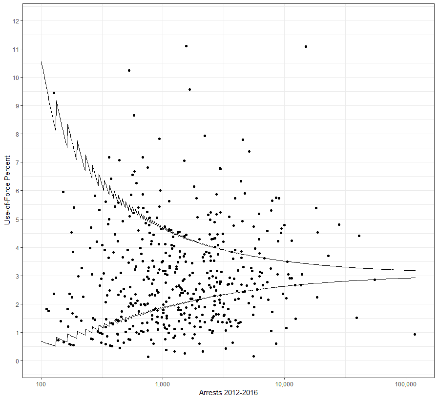
But if you are doing such an analysis you do not want to flag individuals who only make a few arrests, e.g. you wouldn’t want to flag someone as problematic if they only made 2 arrests, and one of them had a resisting arrest charge. One way to tackle this problem is to use a funnel chart. Basically this is a chart that plots the proportion on the Y axis, and the denominator on the X axis. Then you draw a set of lines to illustrate where you would expect the proportions to fall even if they are not different from the overall proportion. Here is an example chart I created showing Use-of-force rates per arrests at the agency level in New Jersey:
I will be showing how you can make a funnel chart like this using the post surveys at the Zipcode level in the post-contact surveys for Lincoln.
First, open up the OfficerSurveys.csv file. To aggregate proportions, it is easier to work with 0/1 data instead of Y/N data. Select the columns E:J (named Q1 to Q6). Then hit Ctrl+F. You should have the Find and Replace dialogue pop up.

Now we want to go to the replace tab. In Find what, type Y, and in Replace with, type 1.

Then hit Replace All. It will take a minute to update, but now you can see all of the Y’s are replaced with 1’s in the dataset.

Now replace all of the N’s and U’s with zeroes (for now ignoring that U means unanswered, as they are pretty rare in the dataset). Go ahead and also turn the data into an Excel table (see back in week 2 how to do this). In the end it should now look like this:

Next we are going to aggregate question Q2, which is “Did the officer listen to your side of the story or your point of view?”, and see the proportion of yes. Create a pivot table in a new sheet. Then in the rows drag down ZIP, and in the Value section also drag down ZIP. This provides a count of the total number of surveys where individuals lived within that zip code. As you can see, we have many areas that are either data errors (e.g. 3), or just zip codes with very few responses.
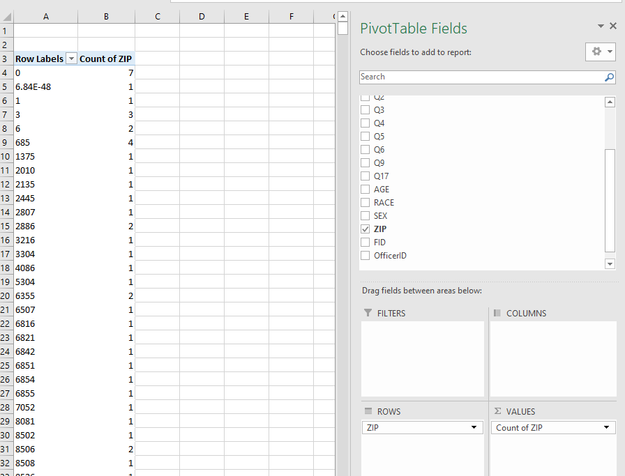
We are going to get rid of very small areas, but keep zipcodes with at least a few survey responses to analyze. Select the dropdown on the Row Labels section in the pivot table, and then select Value Filters -> Greater Than or Equal To.

Now in the dialogue, keep the defaults and type in 20 as the lower bound in the option box. Then click OK.

Once that is done, go ahead and drag down Q2 into the values field for the pivot table as well. We don’t want the count though, but the sum (the total number of yes responses). So go ahead and click on the Count of Q2 and select Value Field Settings.

Then select Sum, and click OK.

Your table should now look like this:

With 0/1 data, to estimate the proportion we can simply take the mean of the column as well (or calculate it ourselves in the table). I will do the former here, by dragging Q2 again, and changing the value field to Average.

A simple way to do analysis of the proportions would be to sort them. For example, we could sort the Pivot Table, showing us the smallest proportions (so those who answered Yes the least frequent):

Notice anything about those zip codes? It is only areas with a very small number of responses that are either at the low (or the high) end. We have an average of about 86% of the responses are yes to this question. Next we will do some analysis to see if any zip codes have outlying proportions.
I have provided a second spreadsheet in your materials, named Spreadsheet_SortPercents.xlsx. This has formulas already provided to help you do the funnel chart and calculate the shrunk rates, as discussed in this weeks lecture. Go ahead and open up that spreadsheet, and navigate to the ShrunkRates page. You will see it is already filled in with a particular example of what happen to be officer involved shooting statistics.

Go ahead and delete the data in columns A:C in the ShrunkRate sheet. Then copy the data in your pivot table (A4:C105) for the zip code Q2 data in your pivot table. Then you can paste in those values in the ShrunkRates spreadsheet. It should now look something like this:

It ends up being there are a few areas at the bottom of the spreadsheet that are not auto-updated with the formulas, so scroll down to the lower rows, and then fill in rows 102 and 103 with the formulas by selecting E101:I101:

And then dragging the formulas down to E103:I103.

You can now see with the auto-updated formulas, we have an estimated Shrunken Rate. As discussed in class, this is one way to sort rates with varying denominators. Here, since most of the areas have so few of responses, their rates are shrunk by a large proportion back to nearly 83%. (I will have to investigate other potential options for default shrinkage, this application it shrinks too much! It works OK though for homicide rates in larger cities.)
Before we go further, you can drag the spreadsheets between different documents. So first if you have not done so already, save the OfficerSurveys file as an excel file (so we don’t loose our work). Then next click on the ShrunkRates sheet, and drag it over to the OfficerSurveys file.

Now do the same thing for the FunnelChart sheet, so we are just working with one Excel document.

You can see the default funnel chart I have created. In cell K3 we need to change the default average rate. You can get this from the ShrunkRates sheet, it is just over 83%. If you type in =ShrunkRates!M5 it will grab the value.

Now we need to change the Min Den and Max Den values (K8 and K9). This defines the length of the X axis in the funnel chart. This should correspond to the denominators in your file, which here range from a low of 20 (based on our own filter) to a high of 7,359 (zip code 68521). So lets make the maximum 7,500. You can see based on these changes how the funnel chart has changed.

Next we are going to change the chart’s X axis to a log scale, as it will improve the visualization and make it easier to compare observations with very different baseline denominators. Click on any of the numbers for the X axis, and then right click and select Format Axis.

You will get a screen on the right pop up with various options. Make sure the bar glyph in the top is selected (it is by default for me), and then select the Logarithmic scale option, and change the base to 2. Then in the Minimum bounds option change it to 16.

Now finally we are prepared to add our actual data to the chart. Go to the ShrunkRates sheet, select the Proportion observations (cells E2:E103), and copy them.

Now migrate back to the FunnelChart sheet, and paste (Ctrl+V on Windows). This does not do the correct denominator for the X axis, so it does not look quite right.

Click on the orange line anywhere, and you can see in the formula bar it is taking the X axis data from a different source. Basically the way the formula works is the first argument is the title for the series (what shows up in the legend name), the X axis numbers, and then the Y axis numbers.

We want to change the X axis numbers (the denominator total) to line up with our proportions. So change the second argument to ShrunkRates!$B$2:$B$103. Also go ahead and change the first empty argument to “Proportion Q2”.

Now we have the right data, but we don’t want it as a set of connected lines, but as scatterplot points. Select the chart again, and right click and select Charge Series Chart Type.

For the Proportion Q2 series, select the dropdown and choose the XY scatter with no lines option (which is just labeled as scatter). Then click OK.

And voila, we have our funnel chart. (I also edited the Y axis to only vary between 0.5 and 1, same way you edited the X axis.) We can see that the spray of the proportions around Q2 are as expected for each zip-code. The only one that is just outside the lines with many observations happens to be when no zip code is listed, and then just barely outside the proportions expected with that many observations. Even with 1,000’s of observations, fluctuations of a few percent are to be expected, but the funnel shows how it gets smaller with more observations.
So based on this, none of the zipcodes with low or high proportions of yes’s for the Q2 question show any difference from the baseline 84%. While this is an artificial example, it would be reasonable to look at something like this for patrol areas for Lincoln (so can see if certain shifts or platoons are doing better), or at the individual officer level.

Other uses of creating funnel charts I have used include:
Note that these charts are un-adjusted rates. For example, you may want to control for the type of incident (e.g. arrests are likely to have a higher proportion of negative responses). This you can’t really effectively do in Excel (and would need to use statistical software). Eventually I will have an update to illustrate the use of those adjusted rates. (It will take use of regression software though, like R.)
Next up is creating an individual officer level dashboard to monitor particular metrics. The first part is old hat at this point – creating a pivot table to aggregate responses to the officer level. We are going to add in sparkline graphs though, and make it so we can print out a nice summary that spans multiple sheets directly from Excel.
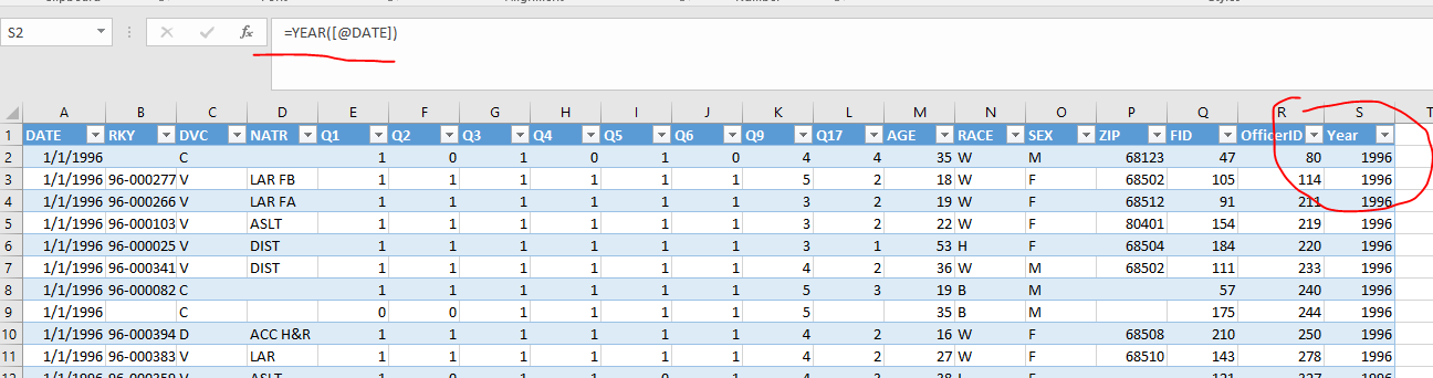
First, go to the original OfficerSurveys sheet, and add in a field named Year into the data table.
Then create a pivot table in a new sheet. Place OfficerID in the rows, and Q17 (“How would you rate the officer’s overall performance in this situation”) in the columns. Then place Q17 in the values field as well, and keep the Count default.

Now, we are going to calculate the proportion of responses for each category. In J4:O4, place these particular labels, that correspond to the responses for each numeric category. Then bold and make the sizes of each column so the labels are not cut-off.
Officer ID % Outstanding % Above Average % Average % Below Average % Unsatisfactory % MissingNow, in J5, place the formula =A5 (to correspond to the OfficerID). Then in K5, write the formula =(B5/$H5)*100.

Now you can drag the formula to the right until P5, then drag it down to the bottom of the table. Change the columns so they do not have any decimal places. When at the bottom of the table, note the overall proportion of responses in each category.

We will use these baseline proportions to identify substantive deviations. For Outstanding, Above Average, and Average, we will highlight cells that are 10% points different than the average (either below or above). For the negative Below, Unsatisfactory, and Missing we will highlight responses that are 10% or higher. We will do this using conditional formatting.
Select cell K5. Then with the Home tab selected in the top toolbar, select Conditional Formatting, and then New Rule.

First, in the top box select the option that states “Use a formula…”. Then to set the conditional formatting, we need to set a formula that resolves to TRUE when you want to color the cell based on other information. Here we set the formula to be =K5>45 – which is our 10% over the baseline average. Then click the Format button.

Navigate to the fill tab, and then select the base lighter blue color. Here we will use blue to signal good and red to signal bad observations. Once that is selected, hit OK twice (once in the Format cells dialogue, and then again)

You will see nothing happens yet, as K5 does not meet the criteria. But go ahead and double click on the little square in the lower right box of K5.

This will apply the conditional formatting to the remaining cells in the table. If you scroll down to row 46, you will see officer 42 highlighted blue.
Now select K5 again, and here select Conditional Formatting -> Manage Rules

You should see the first rule we just created. Now we can make a new one, by clicking New Rule.

Set the rule to be =K5<25, and set the color to red. Go ahead and apply that rule to the entire column. Once that is done, your set of rules should look like this:

Go ahead and apply rules to the remaining columns that meet our criteria I listed earlier, with good percentages as blue and bad percentages as red (each column the references are slightly different). Finally, I want to set a rule to zebra stripe the entire row to a light grey color. To do this set a rule that is =MOD(ROW(),2) – and set it apply to cells J5:P???. In the end your rule set should look like this (I also made the header row a darker grey background:

Conditional formatting works well when you have few data points, but when you have many, another good option is to use sparklines. These are small graphs that can fit within one cell in an Excel spreadsheet. To illustrate their use, I am going to make another pivot table in the same sheet as the table we have already edited. Select cell R3, and then insert a new pivot table (specifying the Table as Table1).

Then for the pivot table, place the OfficerID in the rows, Year in the Columns, and Year in the Values (and change the value type for year from sum of to Count). You should see that this pivot table is now lined up with our other pivot table.

Now select cells S5:AM5, and then in the Insert tab on the top ribbon, select the line Sparkline option.

In the dialogue that pops up, for the location of the graph type in Q5. Then hit OK.

You should now see a sparkline showing the number of surveys an officer had per year over the timespan. Here when there is 0 it breaks the line apart.

Go ahead and select cell Q5. To apply the sparkline to all of the officers, you need to select the bottom right corner and drag it down the entire sheet to the bottom (double clicking won’t work here unfortunately).

This shows a relative variation in the number of surveys folks have over time. There are additional ways to format Sparklines, this just gives you alittle taste. Given I randomly created the officer ID data, there isn’t much to see in obvious patterns.
To prep our dashboard to be printed, select cells J4:Q804. Then in the Page Layout tab for the main ribbon, select Print Area -> Set Print Area.

Next in the same area on the ribbon, select the little arrow in the bottom right (below the Print Titles option) to open up the Page Layout dialogue.

With the Page tab selected in the dialogue that pops up, select the Fit to: option, and change the options to 1 page wide, and leave the page tall option blank. Instead of spilling the columns onto a new page, this forces it to all fit in one page wide, but allows it to use as many pages long as needed.

Next navigate over to the Sheet tab. In the Rows to repeat at top option, type in =J4:Q4. This will repeat the header row for each new page.

Now go to the Header/Footer tab. In the Footer tab, select and select the Page 1 of ? option, and then select the Custom Header button.

In the center section, write Officer Satisfaction Dashboard. Then hit OK.

Now hit Print Preview, and you will see how the sheet is now fitted nicely on the page, and when you scroll to later pages, the same header field aligns with the later rows.

If you print this out now (or save to PDF), it will automatically choose this print area. Many individuals will not want to work with the Excel spreadsheet, so saving to PDF to disseminate to others is the simplest solution.
Another pro-tip if you are actually distributing the Excel document is that you can right click on rows or columns and hide them from the users, as well as hide specific spreadsheets. So if you want to distribute a more interactive spreadsheet, you can still make it nice enough where folks do not see a bunch of junk that they do not need to effectively use the spreadsheet.
For your homework, I want you to construct a Funnel chart for Q2 for each officer. I’ve edited the data to have 3 bad performing outliers and 3 good performing outliers. Create a separate table to illustrate the performance of those 6 officers (plus 3 other random officers that are neither good nor bad) on the Q1 to Q6 questions, and include either conditional formatting to highlight those outlying performances. Extra credit (5 points) to create a sparkline that highlights those outlying performances as well in a clear way on the Q2 question.
Place the chart and table into a powerpoint presentation (separate slides for each), export to PDF, and turn in the PDF.