
This tutorial is for my workshop at the 2017 IACA conference. To follow along, I have posted the data to dropbox, which you can download here.
I wrote an academic paper addressing many of the points I will go over. The article is
I have posted the published paper in the downloadable set of materials. This walkthrough is specifically oriented to recreating several of the graphs and the table in the paper.
I have provided an example set of data, calls in Burlington, Vermont, from January 2012 through May 2017. This is data they publicly post online at https://www.burlingtonvt.gov/Police/Data/RawData. This is a small city of just over 40,000 population. I will go through a walkthrough of generating several tables and graphs that help to identify outliers in the data.
So open up the “OriginalData.xlsx” file, and you should see a blank table (Note the other file, “FinishedData.xlsx”, contains the worksheet that has all of my final edited parts to it.) This is meant to be similar to how you might grab data from your RMS or via whatever query. This is call data from Burlington, but the logic would work the same with incident data.
First, before we move on, lets turn the “OriginalData” sheet into a table. So select cell A1, hold shift, and then scroll down and select cell U47283.
You will get a Create Table pop-up with the cell range filled in. By default it should have the option “My table has headers” checked, but if it does not make sure to check that box before clicking ok.

You will then have a nicer table to work with. Here is what mine looks like, after changing the table style to the grey option.

First we are going to calculate the mean number of crimes that occurs per day on a separate sheet. This will give us a general sense of how often a crime is like to occur.
In the ribbon select the Insert tab. On that tab, then select the PivotTable button.
The dialogue that pops up should automatically select your Table that we already created. Here our table is just named “Table1”. Go ahead and keep the defaults, we will place this pivot-table in a new worksheet.

I renamed my sheet AvCalls to keep it straight. Click on the form on the left hand side of the worksheet (in my screenshot it is named “PivotTable2”, it might not be the same in yours though). Then you should see the PivotTable Fields on the right hand side of the worksheet.

Drag the CallType field into both the rows and the values. This will then make a pivot table of the total numbers of each crime type in our worksheet.

Now from this data we simply want to figure out the mean number of events per day for each call type. To do that, we need to know how many days there were in our sample, 1/1/2012 through 5/31/2017. To do that just enter those dates into two cells at the top of the sheet (or use the MIN and MAX functions), and then calculate the difference between those two + 1. We end up having 1,978 days in our sample of not quite five and a half years.

Now I am going to make an additional column that is “AveragePerDay”. In D3 type in the text “AveragePerDay”. In D4, type the equal sign, and then select B4.

You will now see that it fills in a pretty complicated formula, =GETPIVOTDATA("CallType",$A$3,"CallType","Assault - Aggravated"). To make our lives easier we need to change some of these hard-coded elements. In the formula, change the last parameter, “Assault - Aggravated” to A4. Now we also need to divide the total value by the number of days in the sample, so at the end of the formula add /$G$1. The dollar sign makes the reference absolute - so even if we drag the formula it will always reference that cell. The formula will subsequently then look like =GETPIVOTDATA("CallType",$A$3,"CallType",A4)/$G$1. Now select that cell and in the bottom right corner and drag down.

Once you let go of the mouse button it will fill in the rest of the fields. This is the average number of incidents per day.
Now, if we are trying to figure out a quick number to evaluate whether the total number of incidents in a particular day is an outlier, and we assume our events are Poisson distributed, we can calculate how often that number would happen. Lets go through an example of figuring out what would be an outlying number of incidents for larceny from motor vehicles. It is my experience that there can be sprees of these events in one night. Often times they are easy to spot because of geographic proximity, but what should be our threshold for an anonamlous number of thefts from vehicles in one day?
Lets make another set of columns, call the one PoissonPMF and the one beside it ProbabilityLMV. Here I place PoissonPMF in J3, and underneath it give the values 0 through 10. To figure out the probability of 0 events occurring in a day for LMV, all we need to know is the mean of the Poisson distribution, which is ~1.06 over the study period. In K4, type =POISSON.DIST(J4,$D$12,FALSE).

When you hit enter, you will then get a value of just over 0.34. So given that average per day, if the data are Poisson distributed we would expect there to be zero thefts 34% of the time. You can then drag this down to see that even with an average of only 1 per day, you would expect 4 crimes to happen around 2% of the time.

This may seem rare enough to make a note, but in practice there are two things to be wary of, 1) when you monitor a bunch of statistics every day, you will have more false alarms simply by chance, 2) crime data are never exactly Poisson distributed. The way crime data tends to be distributed is to be bursty - and so have a higher variance. This would make events of 4+ happen more often than the Poisson distribution would suggest. With no other information here I would probably set my “I should look into this more closely” at 6+ per day (at less that 1 in a 1000 chance), but there could be alot of other factors that make those numbers less or more noteworthy. In the actual data, 6 or more LMV’s happened on 20 days, or alittle over 1% of the days in the sample. (I will show in the section on creating a weekly chart how to figure out that.)
This is simple to change for different temporal periods. Say we wanted to know the number of robberies in a week that would be weird given our historical average. Since a week is just 7 days, you would just multiple the daily average by 7. Doing the same excersize for weekly robberies, at an average of ~0.6 per week, makes it seem pretty rare for 5+ robberies to happen in a week.

Next I am going to show how to create a seasonal chart. This chart will have the months on the X axis, and the total number of crimes you are monitoring on the Y axis. Then each year will gets its own line. Seasonal charts help us evaluate the current number of crimes per month, but take into account what the typical counts were in prior years. Instead of having a hard referent category, like in my prior Poisson example, you can see if the current monthly value is an outlier compared to prior data. If it is, the chart I show you will automatically jump out.
If you are not on the OriginalData sheet, move back to that sheet before proceeding.
First, in the ribbon select the Insert tab. On that tab, then select the PivotTable button.
The dialogue that pops up should automatically select your Table that we already created. Here our table is just named “Table1”. Go ahead and keep the defaults, we will place this pivot-table in a new worksheet.
I renamed my worksheet “SeasonalChart” to keep everything straight. After that, click on the PivotTable form on the left hand side (my is named “PivotTable3”), and you should see the PivotTable Fields on the right hand side.

Next we are going to drag the Year field into the column, the Month field into the rows, and the CallType into the filters and values portion.

Once that is done you will see and table auto-populated. This happens to be for all calls. Next we are going to create our seasonal chart. Select any cell in the table (e.g. B7) and then in the ribbon go to the insert tab. Select the line chart types, and in the dropdown select the very first option on the top left.

You will then see a chart pop-up on the screen. Grab one of the white dots on the outside of the chart to make it bigger.

When made bigger this is not too bad a chart. We can see that incidents in 2017 (green) in May were way down (maybe an artifact of the data Burlington posted). You can also exame prior years, although here they are very consistent from year-to-year, the darker blue 2016 calls were down in August through September. But things are generally very similar from year to year.

The power in using the pivot data though is the ability to subset the data for different crime types. Select the B1 cell to get a dropdown in which you can select different call-types, select Burglary, and then see how the chart changes.

We had a low of 4 burglary calls in March, 2017. Although there was also a month in only 5 burglary calls in January of 2016, so it is not too weird. You can also see that in 2012 they had the highest run of burglary calls, with May, June and July all topping 40 calls.

You need to watch out with this chart. If you are aggregating incidents that can have zero in the months, Excel is not smart and does not fill in the zereos. Subsequently the chart it produces is wrong. Go ahead and select Overdose from the CallType dropdown. You can see that in several months there should be zeroes, but the chart just produces missings. This is annoying default behavior by Excel in this situation. You can fix it by selecting a cell in the PivotTable, selecting Analyze on the ribbon, and then in the left select Options -> Options.

In the dialogue that pop ups, change “For empty cells show:” to show 0.

After clicking ok, you will then see the table and the chart updated. This gives us another problem though, all of the future months in 2017 are filled in as zeroes as well.

We are limited in making the chart nicer at this point when pointing the chart to the original data. In the “EditedSheet.xlsx” file I give an example of making the chart nicer. Here I made a separate table and pointed the new chart to that table (You could do the same with copy paste-values from the pivot-table). This gives you the option to make the 2017 series terminate in May and have zero values in the chart. For these charts I like to highlight the recent data as bright red, and make the prior years grey and thinner, so they are in the background. An extra touch I like to add is to make the most recent month have a marker on it, to make it even more salient in the graph.
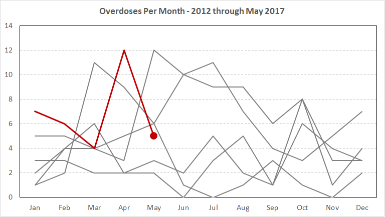
The way this chart is set-up in the worksheet it will auto-update when you change the call-type in the main pivot table. There are some things I would still edit for each chart (for example for overdoses I would make the Y axis tick marks every integer, but that makes the chart not auto-update correctly) – but it gets you pretty close to making some nice charts for a monthly meeting or a monthly report.
The zero problem I showed when making the seasonal charts are more of a hassle when monitoring shorter data spans, such as weeks. I will show another way to make such tables using the COUNTIFS function. Here we will be monitoring the number of events that happen per week, and use averages per the past 8 weeks to identify long term trends as well as short term spikes in the recent data.
First, go ahead and make a new sheet, and name it WeekStats.

In A1, type “BeginWeek” and in A2 type “EndWeek”. These columns are going to create the begin and end times we want to examine. (The same logic would work if you wanted to just look at crimes per day, but there you would only need one column.) In A2, type the date you want to start the series at. Here I go with 1/1/2012 as the start time, which makes the week Sunday through Saturday. There may be other operational reasons though you want the week to start and end on different days. Say you did a weekly meeting to go over stats on Monday - in that case you probably want the week to start on Monday and end on Sunday.
Then in A2 type in the formula =A2+6. This gives us our start and end of the week.

Now we just need to update this to weeks through the end of the sample, which will be May 27th 2017. In A3, type the formula =A2+7. Then drag that formula down until the 283rd row. After that, select B2 and then double click on the lower right hand corner, this will propogate the formula down through all the same cells. So your sheet should now look like below.
Now in cell C1 we are going to type the calltype we want to examine, here Larceny - from Motor Vehicle. It needs to be spelled exactly the way it is recorded in the database, as we are going to use this as a reference in the subsequent formula. Now, in C2 type in the formula =COUNTIFS(Table1[CallDate],">="&A2,Table1[CallDate],"<="&B2,Table1[CallType],"="&$C$1). This is a long one, so lets go through it in parts:
Table1[CallDate] - the date the call occurred in the original data. The condition is ">="&A2, this means greater than or equal to the value in cell A2.Table1[CallDate], and then checks if the date is less than or equal to the end date of the week in cell B2, "<="&B2Table1[CallType], and then sees if the call type matches our header call type, "="&$C$1. I use $C$1 so it always references this cell.After you fill that in and hit enter, you should get a value of 5.

Now you can double click that down and fill in the cells. Note this example runs pretty fast, but this calculation will be slow in bigger sets of data. If you have much bigger data, and you really want to stick with excel, aggregate incidents to the day, and then have a count of incidents per day. Then instead of COUNTIFS you could use SUMIFS. (Although in general with really big datasets I would suggest using a statistical program, like SPSS, SAS, Stata or R).
Now we have our counts of LMV per week. Note we have zeroes in this calculation, scroll down to row 106 for an example.

So unlike our prior pivot table, we do not have a problem with zero weeks. Next we are going to make a moving average of the number of LMV in the prior 8 weeks. 8 weeks is ad-hoc, but worked well for me in the past (see my paper referenced at the beginning of the article). While for the smooth part of the chart you would optimally want some sort of real forecast model, I try not to let the perfect be the enemy of the good. A simple prior average will end up being quite close to an optimal exponentially smoothed forecast model, and will be good enough.
In D2, type “P8Av”. Now we cannot calculate the average until row 10, so in cell D10 we will type the formula =AVERAGE(C2:C9). After you type that in, you can extend the formula down to the rest of the cells.
Now we are going to make some error-bars around our moving average. We can use the Poisson Z-Score formula I talked about, 2*( SQRT(Current) - SQRT(Historical), and set the equation equal to 3 and solve for Current, to create standard error bars that should, with Poisson data, only result in false alarms in around 1/1000. Basically we want to see what values of Current would result in an alarm. Although crime data will not be perfectly Poisson distributed, I show in my paper with an example set of UCR data it works pretty well. So to get the lower bound (lower than expected), you end up with the formula (-3/2 + sqrt(Historical))^2=Current, and (3/2 + sqrt(Historical))^2=Current to get the upperbound of our error bars.
In column E1 type “LowB”, and in F1 type “UpB”. In E10 type the formula =IF(SQRT(D10)>3/2,(-3/2 + SQRT(D10))^2,0), and in F10 type the formula =(3/2 + SQRT(D10))^2. (The if condition is for really low averages, the error bar should never go below zero.) Fill in the rest of your formulas down the seet, and then your sheet should now look like below:

Now we are going to hide the rows 2 through 9. Select those entire rows by clicking on the 2 on the left hand side of the sheet, and dragging the mouse down until row 9. Then right click and select Hide.

Now we are ready to make our error bar chart. Now select columns A, and then C through G, and then go to Insert and select a stacked line chart.

In the chart, click on any of the color stacks, and then right click and select “Change Series Chart Type”.

Then for the Larceny count series and the P8Av series change the type to line. Make sure the check mark for secondary axis is clicked off. Then click ok.

We basically have the skeleton of our error bar chart now. We just need to style it. To style any series select it and double click. First lets select the grey LowB series. Then in the Format Data Series panel on the right, select the Paint Can. Then set the Fill to “No Fill” and the Border to “No Line” - this makes it inivisble in the chart.

Now select the yellow UpB area, but change the background color to light grey, and make it 50% transparent. Set it so it has no border.

Now we need to style the two lines. Here I want the actual data line that is more volatile to be in the background of the plot, and the smoothed line to be more salient. Select the blue Larceny from MV line, then change its Border color to light orange, and change the width to only 1 pt.

Then select the P8Av line, and change it to black. Keep it at the default width of 2.25 pt. I like to also add a point to the final part of the line, to emphasize what the most recent value is. To do this select the end of the line, and then you can add a marker . I like to make the charts nice and big and long. Here is my final version:
You can see in the final chart that the error bars cover the observed series (the thin orange line) pretty much always. There is only one instance of being high, right around June 2014, and a low run around Oct-Nov in 2013.
This is as expected. There are under 300 weeks that have been monitored in this example. The error bars should theoretically limit false positives to around 1 in 1,000.
We can do two more things to automate this chart to make it auto-update to different series types. First, select the Chart Title, and then click in the Formula bar. In the formula bar, then type =WeekStats!$C$1. So now if we update the crime type, the chart will update to give that crime type in the title.

Now instead of typing in different call types, we can make a dropdown to select them. Select C1, and then in the ribbon select Data Validation.

Now you will get a pop-up. On the Settings tab, in the Allow: dropdown select list, and in the Source: cell type the formula =AvCalls!$A$4:$A$25. (This references the PivotTable we made of the different crime types earlier.)

Click ok, and then you will get a dropdown for the C1 cell. Go ahead and change it to different calltypes to check out the differences in the charts. (After you change the dropdown, click F9 to make sure the sheet recalculates.)
This chart is not quite fully automated from week to week. You need to keep adding new being weeks and end weeks to the end of the file (if you know of a good way to figure out automating that let me know!)
The last tutorial I will show is making a nice year-over-year table in Excel. In this I will show how to use my Poisson Z-Scores to highlight noteworthy changes over time.
Go ahead and make a new PivotTable (you should know the drill by now). Insert the table on a new worksheet, and in the columns place Year, and in the rows place CallType. Name the sheet, YearOYear.

Now lets pretend we are just making a report for crimes in 2016 compared to 2015. Select the cells in the pivot table, A4:G26, copy (ctrl + c) and then use paste-values after select L4. This makes it so I can edit the cells how I want them.

Now what I recommend instead of just looking at the prior year, is to make an average of years past. (If you need to only use the past year, it should be obvious how to apply this though.) Select the Q column, and then right click and select Insert.

In Q4, type “Average Per Year”, then hold down the Alt key, and hit enter (this makes it go to a new line but in the same cell). On the second line then type “2012-2015”.

In cell Q5, then type =AVERAGE(M5:P5) and hit enter. Then you can double click on the box in the lower right hand corner of Q5 and it will propogate the formula to the rest of the nearby cells.

Now select the cells Q5:Q26, copy them, and then paste over the formulas with paste-values. After that the cells won’t be referenced by a formula, but will have the actual numeric values in them.

After that we can delete the 2012 through 2015 columns (M through P) and the 2017 column as well. After that is done, here is what mine looks like. (Note if you did not edit the file the exact same way as me, my subsequent cell references might be off.)

Next we are going to add my Poisson Z-score to this table. In cell O4, simply type Z, and then in cell O5, type in the formula =2*(SQRT(N5) - SQRT(M5)). Once that is done, you can expand the formula into the adjacent cells the same ways I have previously shown. Your table should now look something like below.

To tidy up this table, you could select L4:O:26 and select format as table, but I will do it manually here quick. This editing of tables is pretty straightforward in Excel, but here are a list of things I did to make it look nicer in my opinion:
Here is what my table now looks like:

Now my recommendations for highlighting cells is a Z score of plus or minus 3. Here you can highlight those decreasing rows with a light blue, and those increasing with a light orange. So we have mostly large decreases from the prior four year average across many different call types. Noise, Trespass, and Burglary calls are the ones that are the most down. We only have three that are noteworthy large increases, Overdose, Mental Health, and Retail Theft. Here is what my end table looks like. (Intoxication actually has a Z-score of -2.9, so it is on the border of whether it should be noted or not, you may truncate the Z score to round it down if you don’t want to flag cases less than 3.)

Pro-tip: When importing this table into other documents (like word or Powerpoint), you can copy-paste and paste as an enhanced meta-file. This makes it so you can resize the table to fit the space, and make the numbers as big as you can.
If reasonable, you can sort or break up the table so the big increases are at the top and big decreases at the bottom, etc. But with smaller tables of Part 1 crimes you may want to use an order of seriousness, or keep violent/property with one another.